I have had an idea for a "personal logo" for awhile but Pinterest and Google searches hadn't revealed the right thing. I want this to create business cards for supply (substitute) teaching, but also for personal use. Something that would represent me, on a business and personal level. I can't separate them! Once I got the Cricut, I knew it had to be created. Co-incidentally, Hugh was learning graphic design programs. I'm sure he could help me out!

I found a treble clef image. Just finding a realistic, classical treble clef was a challenge. Then I had to find a compass rose. Something bold but not modern, classic but not fussy.

Done! Sent them off to the wonder child, and waited. Like, seriously, only 30 minutes. And then this appeared in my in box!


However, when I took it into Design Space, it wasn't looking right. The compass got thick. I tried playing around with it

I got it broken down into it's parts, but the compass had a white background instead of transparent.

And to make it fit in the clef, it goes over the inner swirl. When I go to cut it out though, I need that overlap gone, and I need the background transparent. I couldn't figure it out in Design Space, and I didn't want to harass my child again. He was still in the early stages of learning Illustrator. The original design he sent looks fine as a print image, it's just not ready for cutting and he's not familiar with what a Cricut does, and doesn't live here, so it gets complicated trying to explain. We'll come back to it later.

Next up was this Canadian Bingo. I saw it in a group and thought it'd be fun for my niece who is a new Canadian. I didn't really like the title font though and I needed it in a format I could use. I tried in Word, using a table, but it was pathetic. Enter Hugh the Hero:

It's a little challenging to see, but the maple leaves are a few shades of red. There's a deer head at the top. I printed on regular paper, but it was kind of washed out. Rob suggested printing on photo paper, so I did, and it looked much better. Megan helped me pick out a frame, and Rob cleaned it and assembled it.
The next thing (actually started earlier) was the logo for the community band I'm in. I want to be able to make bumper stickers.
There's a lot of detail that just doesn't work for cutting out in vinyl. A couple years ago Hugh re-did the design so it could be embroidered on to shirts. It's mainly the blue and yellow inner, with a black outline and a silver banner but not the bottom banner (I think....not going to go check).

I had to do some disassembling. I notice the top of the shield is a bit jagged.

The different parts of blue (and yellow, etc) had to get "attached" so they would cut like that, instead of individual parts.

There was something about the letters...I decided I wanted the black on top so I welded the shapes over the letters because I couldn't "contour" them for some reason.

I learned about registration marks, and used them. I learned about layering with parchment paper, and did that. But the black outline was too thin and there was a black cross to divide the segments but it was also way too thin. It easily got skewed. I had issues with getting the text off the backing. One thing after another. I ended up putting this on the inside of my work binder, but it's textured so the tiny letters don't really stick. Rob tried to tell me to make the whole thing black and put the parts on top, but I was frustrated and didn't really understand. After some more videos and projects, I clued in. I re-worked it so the silver also includes the shield. Then there's a solid black layer, and then the 4 segments on top. The letters...I can't remember...I think they are cut out of the colours so the black shows. I haven't tried re-cutting it yet.

Megan figure skates, as evident in many blog posts. I thought I could easily whip up her club logo into a file to make bumper stickers, water bottle labels, etc. Just follow the videos! It started out fine but I ran into troubles so Hugh rescued me again. I don't understand how a 3 colour image could be so difficult. A big issue was the quality of the initial image. Neither of us could find a good one. In the end, this one should work. On the water bottles the club handed out, it's just one colour--the blue, and the rest is transparent. Boring! But easiest when mass producing.

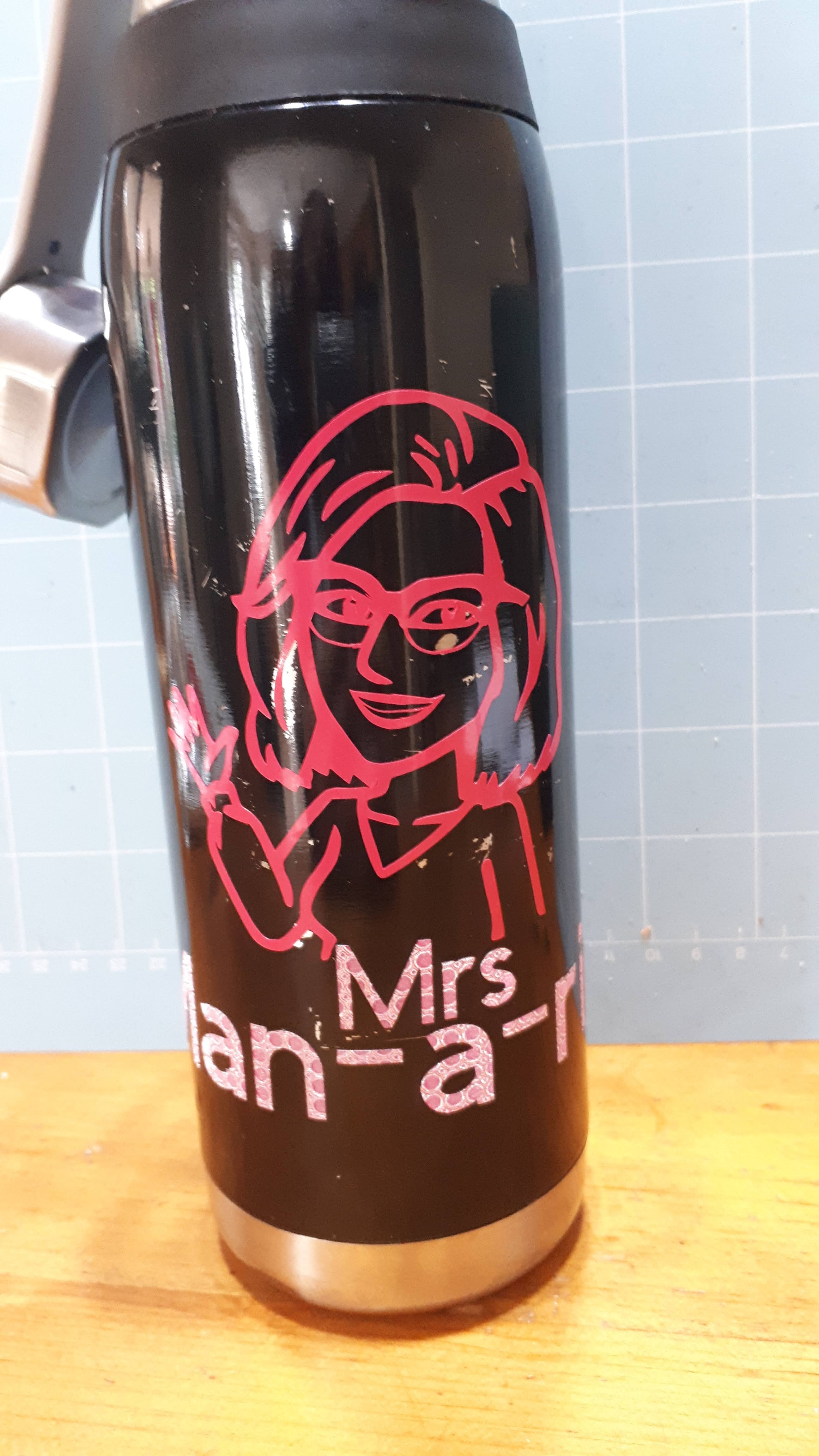
Next up---a Bitmoji image! I saw several videos on how to do this! It was going really well, but I had issues with my mouth and the thin line of the bottom of my glasses. Hugh fixed it and wow! It's adorable! I love it! I put my name as how it's pronounced. This makes it harder for students to search for me on social media LOL. I put it on my old bottle as a test. I haven't gotten around to putting it anywhere else, but I think my truck needs one.
Up next will be more projects I did without help LOL. I think I got ahead of myself with the band logo and I needed to step back. I got more into learning Inkscape, and doing some paper projects.
No comments:
Post a Comment