Wednesday, December 30, 2020

Baby Hat Pandemic

I wrote in the summer about knitting baby hats for the local hospital (Post 1; Post 2). I kept going! I bought three large balls of yarn (Loops and Threads "Snuggly") before we went to our cottage vacation, and they kept me going for quite a while. I have some of the yellow left but I don't think I'll get it used by tomorrow, so I'm wrapping up the year now. 

I've been just putting them in a bag, I didn't realize how many there were! Apparently, I didn't take a picture of the dark purples on their own, but they were 110gr. 

3 dark green (two were a strand of green and blue, and one was 2 strands of green): 71gr

There's 4 or 5 here, 111gr (I still have some of this yarn)

I think there might be six here; 115gr

Again, 5 or 6; 114gr


3 or 4; 72gr

James Bret Marble DK, 2 or 3; 167gr. This yarn says DK, but it's closer to worsted

Done on the standard gauge machine, two or 3, 87gr

All totaled, 847gr. I have several still on the standard gauge, waiting for more before I take them off to do all the finishing at once. They could be done tonight, but I do want to make more before taking them off the machine.

Yarn In:   6477gr
Yarn Out:  847gr + 10635gr = 11482gr
Balance: 5005gr gr more OUT than in!
Costs:  $140.68/365 days = $0.39 per day


Monday, December 28, 2020

Tricolour

 What is "Tricolour"? It is the official colours of Queen's University, Kingston, Ontario (Canada). A royal blue, scarlet red, and golden yellow. They do have actual colour values, and I believe it's trademarked. However, for aftermarket items, sometimes things are more rust, or more golden. It can be hard to get red, yellow and blue in the same item if you want to make something, like yarn. Often, there's a good red and blue, but no yellow.  Lucy wanted me to make her Tricolour mittens for Christmas. She drew out the design even.


I first looked at an Ontario wool company and found red and blue, but no yellow. Then I remembered about Topsy Farm! Located on Amherst Island, just south-west of Kingston, they would be familiar with the Tricolour! I contacted them, and had some great customer service!! Top notch. This is what you get with farm to fork. Or, farm to needles! They pointed me in the direction of their Tricolour woven wool blankets, and indicated they used Sunflower Gold. It was not the yellow I had selected, but I trusted their intimate knowledge of their yarns. 

Then I was shocked at the shipping cost. It seemed a lot for 339gr of wool. I asked if they stocked it at the locations listed on their website, but no. If my kid could meet them at a certain location in Kingston the next day, they could bring it into town with them. It wasn't really practical for my kid as they don't have free bus service this year. So I asked about the shipping and they said they will charge only the actual shipping--the website averages out shipping costs. So they saved me some money and I'm really grateful! Not only that, it arrived SO quickly, and before Christmas! I had planned to just wrap up Lucy's mitten sketch with an IOU. I was able to wrap up the wool! 

When I opened the box, I was a little disappointed with the earthiness of the yellow, and Rob said it was flat out wrong. I said, it goes with the natural qualities of the wool---it would be strange if it were bright yellow. It would also not show dirt like a bright yellow, and there was only supposed to be small amounts. Lucy said she liked it, so that's the final decision! Sorry, no pictures, it's too awkward right now. Just go to their worsted wool page  and scroll down to the red, royal blue and sunflower gold. I wanted to get the totals in before the end of the year. I know I could have the mittens knitted before the 31st if I got my butt in gear, but I don't want to rush, and I'm picking up more duties around the house now. 

Yarn In:   339gr + 6477gr = 6816gr
Yarn Out:  10 597gr = 10635gr
Balance: 3819 gr gr more OUT than in!
Costs:  $140.68 + 44.07 = $184.75/363 days = $0.50 per day

When You Can't Ignore It...

 ...embrace it!

I had my peroneal tendon repair surgery and the recovery nurse suggested using a stretchy fuzzy sock to cover up my toes/extremely thick dressing. The ones we had didn't fit, so Rob took one of his orphaned wool socks and cut the toe off. That was okay, but it was a dull grey and didn't have great stay-on ability (the green is painter's tape). I decided to knit my own cover. 

I went with some worsted weight yarn, and a rib, and basically, knit a sock toe. Easy. Then, I made a heel cover by casting on almost enough to go around me (basically what I had ended with for the toe piece), then did short rows like a short row heel, but in garter stitch. To make the ties, I cast on a length of stitches, then casted off. I usually would get a crochet hook and just make a chain, but I didn't want to bother anyone to go find my hooks. 

Then I got lucky and found some bells in my craft drawer. 


The only place it got seen was when I went to my follow up. No one commented! No worries, it still make me happy and kept my toes and heel warm!

Yarn In:   6477gr
Yarn Out:  38gr + 10 597gr = 10635gr
Balance: 4158gr gr more OUT than in!
Costs:  $140.68/363 days = $0.39 per day


Saturday, December 26, 2020

Personalized Layered Letter

 It's hard coming up with gifts for my niece. Now 14. she is blessed with not needing anything. We used to give her a lot of Canadian themed items, but now that's she's living up here for school, that's not quite as cool. I had tried to make a layered N for her in the summer, but for some reason, the N file in the Zengo font didn't work the same as the other letters I've done. 


That swirl in the upper left wouldn't offset like the other swirls. 

So I went to my fonts in Inkscape, and found a pretty bold one (it might have been Baskerville, as you can see, the outline is very similar to the Zengo outline). I wanted as much space to play with as possible. Then I found the Jokerman font and used that to spell Nya. I liked this font because it had little cut outs in the letters that would create cool outsets in Inkscape. I placed each letter individually in the mid section of the N.

You could use another font and create your own cutouts within the letters, or use a thinner, swirlier, font and have the layers show on the edges only

The top layer is lime green, then orange, then black. Something I didn't pay attention to was how thick the lime green was on the legs of the N. I liked how it, and the orange, created parallel lines, but the lime green was a smidge too small for the micro adhesive foam dots, so it had to be glued on. 

And it was not the easiest thing to line up, with those long skinny wobbly legs. I would consider adding horizontal pieces to brace the two legs together, or making it a smidge thicker.

The bubble layers were fun to do. I was designing this without looking at my cardstock selection. I knew I had a fair selection of colours, but when it comes down to actually putting them together, that's another story!

I made the little easel from Special Heart Studio. It's great to include, in case the receiver doesn't want to hang the letter on a wall, or in a frame. 

I wish I had gotten better pictures, but it was a very overcast day, I was in a bit of a rush, and I was on crutches, with no weight bearing on my foot. So, not the easiest scenarios for getting pictures! I look forward to making more designs like this. I haven't seen anything available like this out there, as it would be impractical to do it unless on a custom basis. And if you've been reading this blog for awhile, you know I like custom work! Got an unusual name and want a personalized gift? Not every letter and name combo would be practical for something like this, but it's fun to try new things!

Sunday, December 20, 2020

It's Just I A....

 When I was in a community knitting guild, we were not allowed to introduce projects during show and tell by saying "It's just a pair of plain mitts/a dishcloth/a baby blanket". Each item is a commitment of time and a display of talent. You made something that did not exist before!! We could say "It's a pair of plain mitts", but no "just" allowed. To someone with cold hands, it's not "just a pair of mitts". 

This little label I made for my calendar. I like a paper calendar I can throw in my bag and write things in. It felt a little plain, so I took a phrase an old friend says to me, and dressed it up. It means, in Latin, Time Flies.

I did the shadow layers/outset in Inkscape. No fancy scripts, no flourishes, just clean and simple. The green layer reflects the light but is not reflective vinyl. It's not holgraphic but has that kind of look, it depends on how the light hits it.


I posted a design I just did in a FB group, and a couple people said they wished they could design like that but have no idea how. Five months ago, I had no idea either. I really had NO idea. I didn't do anything with fonts, graphics, design, nothing at all. Making a Power Point was  a  struggle for me. I started small and simple--the bottle labels are a good example. I needed labels, and it was a way to explore fonts, clip art, vinyl. If they didn't work, or weren't awesome, no big loss. I learned a bit with each. This label was going to be two layers originally, though I don't remember if it was black and gold or black and green. I think just black and gold. I played with the alignment--the T and the F lined up was my default, but I moved it around and closer together and liked this much better. 

It's simple, it's not a necessary item but it adds a nice touch. Not everything has to be a majestic 9 layer wall art! Just get started. 


Wednesday, December 16, 2020

Christmas Cards

 Every year, I want to send Christmas cards. The thought of postage though... it's like 80cents a card here. Adds up! Then on Facebook, I found out that the student leadership group at the high school where my kids go/went, was having a challenge to make Christmas cards for local seniors in senior residences. Students could get volunteer hours. Well, sign me up! Okay, sign up Megan. I started googling easy Christmas cards. I had trouble getting started, so I went into Design Space and found some free images and got cutting, figuring that Megan could make watercolour backgrounds, or even plain backgrounds. 

I had some glitter vinyl from Dollarama and cut snowflakes. I had a lot of trouble trying to get the settings right. Sometimes it cut all the way through, but more often it wouldn't cut deep enough. 

After making the house and the gingerbread girl, I wanted to do more with pens! I made some in simple rectangles, and some I did a little more with making a nice shape to cut out. I didn't really know at this point what size the cards would be though. 

I went to Michaels and got some Christmas paper pads. One was solid colour papers with embossed designs. It was nice and simple though some of the colours were a little strange. We got the table cleared off on a rainy/snowy Sunday and got to work

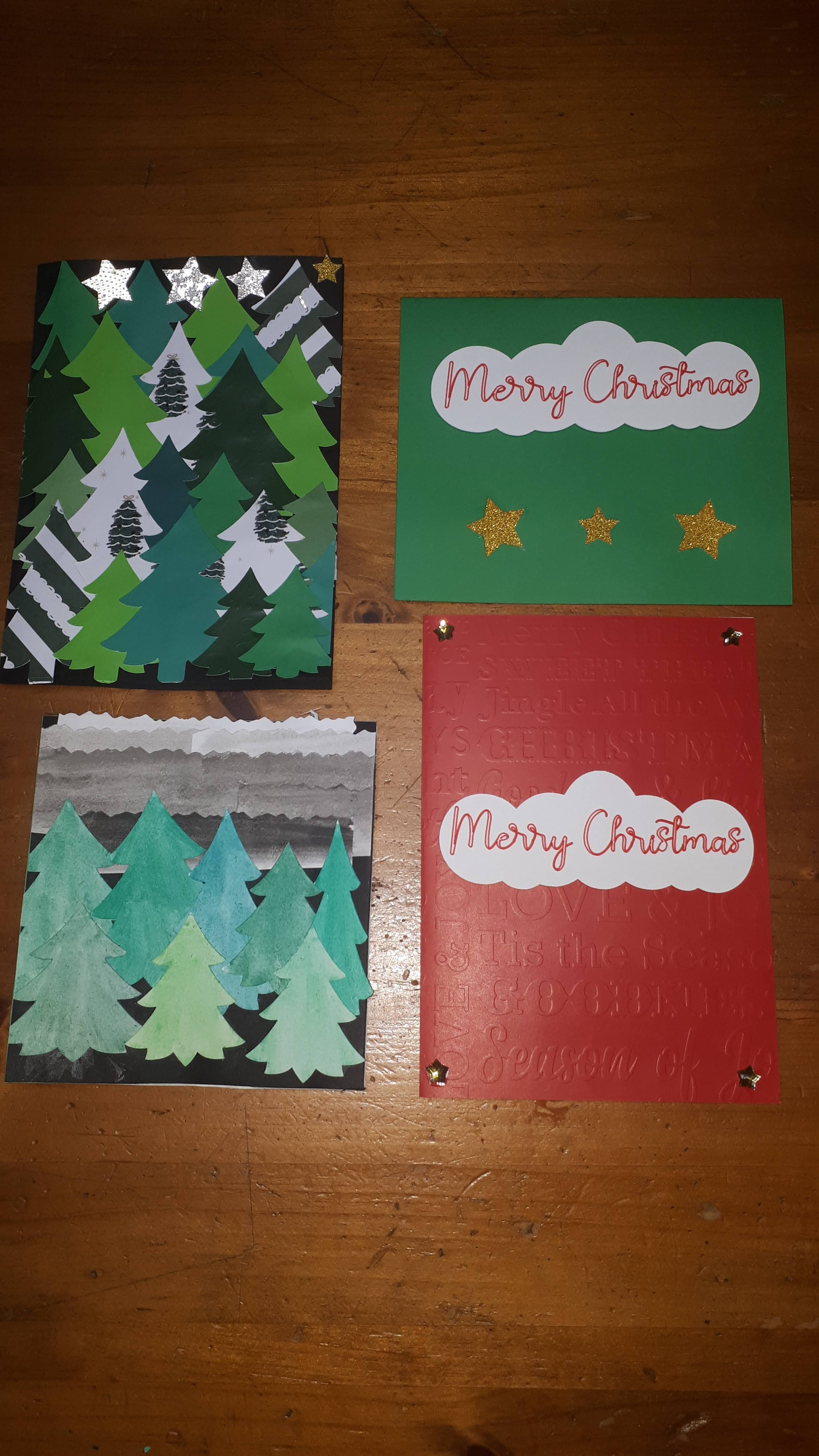
I cut the tree shapes, and Megan watercoloured them, and strips for for the sky.

This is upside down actually. The turquoise strip was left over after cutting out snowflakes. It was the perfect size for the card. The silver is very sparkly vinyl film from Dollarama. The card of the left, that's a free image in Design Space. It's #M47422. No Cricut Access needed. This one was cut out of the silver vinyl and stuck down to black card. That was not easy though. More ideas with it later

Megan took this paper that is embossed with birch trees, and cut the leaves out of a printed page with a full page design. She used fancy edge scissors to make the snow. She also put some snowflakes inside.

This snowflake is a two layer free design in Design Space. For the banner, I made a rectangle, then a triangle. Duplicate the triangle. Line them up over the ends of the rectangle and slice it out. Then a simple font for Happy Holidays. The tiny silver snowflake in the centre of the big one is from the snowflake panel card that was cut in the foil. When you weed it out, there are three tiny snowflakes that come out

I found the Christmas tree in Design Space, again, a free design. It's in three pieces, so it's easy to make the top star in a glitter. I used all sorts of green cardstock, and some of the green embossed papers. The snowflake was a free snowflake. I took a rectangle, centered it, and welded it to the snowflake. Then used a simple free text. I don't mind the "bubble letters". Sometimes I colour them in with the same colour, or with a contrasting colour. The Merry Christmas was made by welding a bunch of ovals together. The pointsetta I'll mention below.
Look how glittery this snowflake is, cut from the Dollarama vinyl. I found that sticking the vinyl to cardstock really worked the best over all. Trying to stick down the vinyl, with it's flimsy floppy snowflake arms, nice and tidy and straight...was hard. So, stick the vinyl to cardstock and run that through the Cricut.

There were lots of scraps of green paper. I took the same tree as earlier, and contoured out the trunk and star. Then I made a small rectangle, and an oval. I placed the oval at the bottom of the rectangle, then welded. Then welded that to the tree. Now it cut the trunk out with the tree.

I looked at cards I had, and Googled ideas. I downloaded a couple Christmasy fonts. And tried what should have been a simple task of writing text, and attaching it to a shape.


Design Space did an update and the whole Cricut world fell apart. Items couldn't be welded or attached properly. They couldn't get moved on the cut preview screens. It froze up. Then, add in my own True Tracy Way of doing things, and forgetting to change the paper size once I finally got it going...And then...Cricut decided to print over top of what it already printed...

Lots and lots of snowflakes! I have a large envelope full of leftovers.

The bottom left was the snowflake panel glued onto very glittery light teal cardstock. I love it! The top right one I really had to put on my thinking cap. I wanted it cut out of the card itself. I tried slice, but that wasn't right. Eventually, I realized I had to slice out a square from the card base piece (most were 7x10" so folded in half, they were 5x7") and then WELD the snowflakes to the cardbase inside the cutout square. Make sure to leave enough border between the cut out and the fold as it's pretty delicate. If you have a scoring wheel, that would make it easier to fold. I used turquoise cardstock, then a shiny silver cardstock from a little pad I got in the Christmas craft section at Dollarama.

I wish you could see how it glitters! This is a high impact card without a lot of work or materials. My favourite type of project!

More of the trees. Some were from the papers embossed with wintery designs. I wish my pictures were better but November/December is hard for taking pictures in my house. That pentagon on the bottom right was fun. To get the card shape, I made a pentagon and duplicated it. Then I flipped one upside down, and overlapped the point a bit, equally on both pentagons, then welded the two together. One card was made by slicing the tree out of the card base and putting tissue paper behind.

Some really basic cards, and some fancier ones. The embossed paper was nice in real life but hard to see in the pictures. 

The pointsetta design is free, from Pocket Wonders.   The two right ones were cut out of cardstock, the veins added by hand, and glued to the embossed paper bases. The hexagon one, I made a hexagon, duplicated it, put them side by side, then welded. Then I took the larger layer of the pointsetta leaves, and sliced it out of one side of the hexagon. I put red tissue paper behind, and drew on some veins.

The top card is a free project from Handmade in the Heartland. I used the embossed paper for the cardbase and forgot to set it for heavier paper and it didn't cut clean. Then I had issues when gluing, and well, there's a bit of shadowing look to the card. It's a nice card if you're a little better than me with glue. The bottom one took that Merry Christmas part that got weeded out, and I just stuck it to paper and cut around it.

These cards are from Shirley's Templates.  I'm not going to link to each one. My suggestion is to click on each year in the sidebar on the right, then scroll backwards till about Sept of that year. Do this for each year. She has a TON of free Christmas card designs. The top one says "Christmas Greetings". I thought it would show up okay in that striped cardstock, but it didn't, so I coloured in the white parts of the letters. It's better but not my favourite. I did add some little star plastic flat beads to the stars. Flat beads is not the right name. Like, shaped rhinestones, except they're from Dollarama. They have these little Christmas card making kits with sequins, beads, snowflakes, etc. 
The bottom card has the background cut from dark teal glitter. The "Merry Christmas" are on foam tabs. We weren't thrilled with how it looks off balanced. Merry should be at the top with two snowflakes. You can't just do that though because there is a white blob under where Merry goes. 

This is the middle one from above (I linked it). I LOVE it. the circle background is a fine silver glitter paper from Dollarama's tiny pad of gold and silver glitter and foil paper. In the very center I did add a silver snowflake from the cardmaking kit and a bigger white snowflake. It's a delicate card to cut out, but worth it! If you download any from her blog, be careful what you click on. You want the blue rectangle in the Media Fire box at the top right. Not any of the "download" buttons over on the left. 

I believe the top one is also a Shirley card. I used the weeded out bits to fancy up the other cards. Behind the Merry Christmas panel, I used sparkly gold foil vinyl from Dollarama, stuck to cardstock. It practically glows when the light hits it.

We did have to send a thank you card to someone, and the girls picked the Merry Christmas card but wanted a shadow layer added. I did that in Inkscape. I messed up the sizing on the first two tries, but this one is very lovely, with silver foil. It's amazing what adding just a little offset layer does to a project. I don't understand why Design Space doesn't have that feature. I also don't know why Blogger doesn't let you edit the photos within the page. 

We ended up contributing 30 cards! I hope to get started earlier next year (like...maybe next week?). I have lots of bits left over, and will of course look for marked down materials in the new year. The only cost for these was materials. I never thought I could do this when I first bought the Maker and everything I found was so not my style. I already have designs lined up for next year!!


Tuesday, December 15, 2020

You Can't Catch Me!

 It was feeling like every time I turned around, Gjoa at Special Heart Studio had another awesome design I wanted to do. Let alone trying to do ones from before I even got the Cricut, I couldn't keep up with her current designs! This one was no exception! I knew I needed it from the moment I saw it!

I made a special trip into Michaels' to get brown cardstock. Amazingly, they had a variety pack of brown! However, despite the two dark colours looking different in the package, they were really similar once cut out.

I thought about maybe doing the back in black instead, but someone mentioned burnt cookies... I really wanted to get some textured or glittery papers to make more (but sadly, have not).

As soon as I saw these guys on her website, I knew I wanted to see if I could alter it so it looked like a bite was taken out. My friend Cherie, owns a great boutique, Beadle, and years ago sold adorable felt gingerbread men with a nibble from their arm/feet. They were so cute, I wanted paper versions. 

It took some figuring out, but I managed to do it!! I couldn't just cut off chunks from the arm. There is a border on the pieces to give a smooth edge. 

I did a different combination of papers this time. He's more subtle. I like them all! The girl one came with the original file. It was a great reason to buy some more pens that would work in the Cricut. I bought Staedtler Triplus Fineliners at Wal-Mart. Of course, I'm seeing them cheaper and in bigger sets, everywhere now that it's closer to Christmas. I did have to wrap painter's tape around the pen to get it to stay in the clamp. And, apparently I missed the step about attaching the draw layer to the piece it draws on to. 

Look at the detail These guys have only two layers with the overall design, but it's enough to be really effective.

I still smile every time I see this! LOL! He's so cute!

Look at that nibble! Poor guy! LOL! Changing the smile to a frown would have been too much with this file, but I think he's fine with a smile. I'm so glad I got these done early. I wanted to do more, but I just haven't had time. There's always something new to make!!