Saturday, January 30, 2021

One Makes a Difference

 I like to have a "purse" project on the go, for those impromptu car rides, waiting rooms, movies where I can't follow a pattern. Starting last summer, it's been primarily newborn baby hats. I've used up almost all from the three large balls I bought in the summer. I'm down to just some yellow. 


One end of the remainder was the dark yellow. I didn't like how it changes from dark yellow to the next colour, so I decided to alternate rows with both ends. It lightened the dark yellow but still left it somewhat of an abrupt colour change when the dark yellow changed. 

I used the technique from the helix hat pattern. That pattern isn't the one that I first used. I can't find those on my blog, but I did find this, from 2012:  

...done using a "helix stripe" technique, where you use at least three colours, knit in the round.  Knit 1/2 the stitches with the first colour, then the second half with another colour.  You're back at the start, and change to a third colour.  When you get to the first colour, drop the third--do not twist--pick up the first, and keep going.  You do not get holes.  The only secret is to never, ever frog back by taking it off the needles. 

I was only using two colours though. You can use as many as you want. The key is that you knit around, knitting the last stitch used with the previous yarn, drop the yarn you were using, pick up the new one and knit on. Do not twist the yarns! Just check that the stitches have the same tension. This method does not create a ridge on the inside. It's really nice and smooth. 

This is just one small hat, but you never know who will feel blessed by it, or motivated to learn to knit, or to make hats for donating. It will go in the bag with all the other baby hats. In awhile, I'll contact someone and have them delivered. 

Yarn In:  0gr
Yarn Out: 500gr + 17gr = 517gr
Balance:  517gr more OUT than in
Cost:  $0, $0/day


Thursday, January 28, 2021

I Knitted

 I had planned to do a lot of knitting while recovering from my surgery.  However, I didn't realize how challenging getting back up the stairs from the basement would be. I knit while watching TV, and sitting upstairs, knitting while watching YouTube, just didn't feel the same. Also, Rob works in the basement, so it wasn't the most pleasant environment to enjoy the relaxing qualities of knitting LOL. 

I did just get one blanket for charity finished. And I love it. I bought this teal ombre yarn in the summer when we were on vacation. A few weeks before surgery I got out the yarn options for the next few blankets and asked in a knitting group which solids should go with which variegated yarns. I knew that the variegated yarns would not be quite enough for each blanket, so the solid colour would stretch it out. One member suggested tan with the teal yarn, to play off the feeling of a Caribbean beach. Bingo. I knew I had to pair it with a feather and fan stitch pattern. 

Certainly not Caribbean beach mood outside now. 
I did the tan ridges at random, never more than two in a row, and never more than two teal ridges in a row. 

Simple garter stitch edges, 5 stitches wide, and 3 ridges top and bottom. I cast on with a crochet cast on so it would match the cast off.

Feel those waves crashing in. 


Such a beautiful yarn. It was a 1lb bag of "Unknown Fibers" from Cambridge Fibers. It had a little bit of a stringy look to it before washing. It almost felt like cotton. Once machine washed and dried, it plumped up and is nice and squishy now.

At least one kid has said not to donate this one!

Yarn In:  0gr
Yarn Out: 500gr
Balance:  500gr more OUT than in
Cost:  $0, $0/day


Thursday, January 21, 2021

Designing Snowflakes

 This wasn't the tutorial I had planned to write next, and I think Inkscape knew it and gave me a hard time. If you've been here awhile, you know that I believe yarn can talk, so it's only rational that Inkscape can pick up on my inner thoughts too. 

(Yes, I'm joking. Though....yarn really can speak to you!).

If you were on social media this fall, you probably saw the "F*** Flake" snowflake ornament. Imagine a word starting with F, creating a snowflake, a circle at the centre with the year in it. I love snowflakes, and knew that the tools in Inkscape should make it really easy to design some. However, finding tutorials and videos on how to do this was not easy. I found a few, but nothing that really gave me what I needed. Then I found this video:  https://www.youtube.com/watch?v=LQqRfMP_hl4 The sound quality is not very good, so turn it up. I also found https://www.youtube.com/watch?v=uwTe0jhOYEU but he seemed to take the long way around on some elements. There's somethings to be learned by watching both though. I realized that watching videos geared for Glowforge, or laser cutters is more helpful for Cricut users than general Inkscape videos for graphic designers. There are things you need to consider for Cricut or laser cutters that you don't have to think about when creating a digital image. 

Originally, I wanted to cut these out with the Cricut, but because of my surgery, this wasn't really possible at the time. Perhaps for next year (which, is really this year, but my years typically follow the school year, so "next year" is September LOL). Since I'm learning more and more digital design, I started getting really creative with these. Let's back up though to a basic image. 

I had intended to cut this one out, but just couldn't get to it. This is what we're aiming for in this tutorial, and then I'll expand on it a bit if you want to just make it a digital image.

First step, for Cricut users, set up the Document Properties like this:
Display units and Custom Size units are both in inches, the custom size is 12x12, and the Scale is 72 in the x window. This will ensure it will import into Design Space at the size you intend it to be. 

Open up the Text Editor (the A on the left side), and either choose your font from the top font menu, or just type your text and then scroll through your fonts on the right side, seeing how it looks in different fonts. I used Amrelia. Do not click out of it or convert to a path.
What makes these snowflakes fun (to me) is all the "swirls", usually called glyphs or swashes. Not all fonts come with them, but the ones that do usually mention it as a selling feature. To see the glyphs, you need a "character map". The one that comes with Windows 10 is pretty useless, as it's so small. If you're using Windows 10, download Character Map UWP from the Microsoft store. 

To use it, scroll through and find what you need/like and select it. Click +Add (towards bottom). It'll add it in the lower window. Then click copy. Go back to your design, and click paste where you want it in your text.

Here's where the tutorial gets tricky. I went back and forth from this step, to the next, and then starting over as I tried different combinations of glyphs. It's not until you rotate it that you can really see how it will look. So don't despair if it takes a few tries.  If there are no letters with hanging tails, you might want to change more letters to ones with glyphs so that the words will connect with each other when you rotate them, for strength (if cutting out). As you do this more often, you'll start to visualize text in different ways. You can always use the Bezier pen to create swashes to connect the snowflake arms in a decorative way.

Also check it with View--->Display Mode--->Outline View. You'll see that this particular font is really skinny! You might want to use the Outset function to thicken it. You follow the same process as in earlier tutorials to create an offset, but you don't need to change colour, or lower it, and then you'll Union it to the original text. 


Once you like your text, use the selection tool, and Path--->Object to Path.  Then Object--->Ungroup (a few times might be needed), then Path--->Union. If you are keeping this digital, you can leave the Union till later in case you want to change something.  However, if you are going to cut this out of cardstock, you want to make sure all the letters are connected somehow. 

Take a look at the outline view, using View--->Display Mode--->Outline. If there are gaps between letters or parts of letters, you need bridges. To do this, you can look at it with the Node Editor and see if any nodes can be moved slightly. Or, you can Union in little rectangles like in the second video I linked to above.  If you want to keep this digital, and have a neon feel to it, you need to create gaps  like Nick does in this video starting at the 3:50 mark: https://www.youtube.com/watch?v=fE-gKcJC8M8&t=12s 


Once you are happy with your text, the fun part starts. Wait! Hasn't this been fun all along? LOL. It's time to rotate! Select your text, go Path--->Path Effects (at the bottom of the list). This will pop up the Path Effect menu on the right. It's a large box with a small + icon at the bottom. Click the icon and the following screen will come up


. Click "Rotate Copies" (here, it's the first icon in the 5th row. It might be in a different place on yours depending on screen size).  
This will rotate your text and pop up the following dialogue box off in the right panel.

You can play with these values. Although snowflakes have six "arms", if you have a long skinny text, you might want to up it to 8 copies. 


You might be looking at your snowflake, and say "it's squished together in the centre! I want the circle with the year!". In the videos above, they made the circle first, but for some reason I do it after. We need to spread the snowflake out a bit first. 
Click on the Node Editor and then the snowflake. See in the centre there are two blue lines that meet in the middle? You need to drag that centre node to the left. It's touchy! You might be able to use the arrows keys or the CTRL button to keep it centered. I haven't tried. 

As you drag it out, picture a circle with your chosen text inside. If you're going to be cutting this out, You don't want too much of a gap between the words. 

I was just playing around to make sure I got these steps right, and see what happens if you try to use the arrow or CTRL key. I moved the centre node outwards, then upwards, then back in, and got this neat little design:

Originally the heart was sitting on the upper left tail of the nextT. Since this makes the centre closed in and connects all the arms, it would be okay to cut. You could probably fit a small year in the centre too but oooohhh...what about hanging a little glittery snowflake in the centre? I was just playing though and didn't add any fancy swishes to the end of my name. I'll have to go back and start again. That's what I mean about going back and forth. I wish you could do this directly with a word without having to convert to path, because that makes it hard to add decorative letters. 


Next you're going to use the Circle tool and create a circle. Make it with no fill, and just a stroke. You might want to go back to the Node Editor, select the text, and make the snowflake tighter or wider so it touches the circle "nicely". I didn't like how the C wasn't quite touching. I tried moving nodes, but that made it strangely funky. I thought about making little bridges, but that got tedious because I would have to do each C. So I decided this would be a digital design. I could have also altered nodes so the hearts were tucked in a bit, letting the C touch the circle, but nah...

Don't forget to go Path--->Stroke to Path! If you don't, when you go to weld later, this will happen:

Oops. Just one of many glitches while I was working on this!

Time for the inner text. You don't have to stick with the same font, though I did. You can go straight across, stagger, or stack, whatever you want! I used two text boxes, one for each line. Place them in the circle, size, move, size, move, etc. I use the Outline View again to make sure the text is overlapping the circle a bit if I'm going to cut it. You also want to make sure the text is going to be secure, by touching each other somehow, depending on how you put it in the circle. Here, I've Unioned the text (Path---Object to Path; Object--->Ungroup; Path--->Union. You can see how the two 2's merge in the middle. I haven't Unioned the circle to the numbers, or to the name. You can see how the numbers overlap on the circle, especially at the top of the top 2, and the bottom of the 1.

Here comes the fun part. Wait, I said that already. It's all fun! Now we get to union everything! Select the text, and Object--->Ungroup. Make sure each letter is ungrouped. There should be one box per letter, and it will say at the bottom something like "5 objects of 24 nodes". 

Then Path--->Union. Somehow, I missed the l in the picture above. 

Check with outline view and make sure it unioned. Here's the outline view before Union--you can see where the swirls overlap. That would all cut out. 
Sometimes with text, when you Union, the text will suddenly be way thicker. Undo (I think you'll have to hit it twice). Then use the Outline view and see if there's an additional line in the text. There might be a stroke on the text you didn't know about and you had at some point, converted that stroke to a path as well, and now it's all unioned. Or, if it didn't union, that stroke hasn't been converted and is holding up the process--like when you're in grade 1 and you have to make a circle, holding hands and there's one kid that won't hold hands. Making sure all the text is selected, hold shift and click on the X at the start of the colour bar at the bottom left. Alternatively, I have had to use the Objects panel, find each stroke individually and delete. 

Sometimes my computer doesn't like it when I'm trying to Union. It can be because there is something grouped. The Objects panel will show that, or go Objects--->Ungroup and see if the info bar at the bottom of the screen says something different. It should say "No grouped objects" or similar. Other times, my computer just can't handle a big task, and I break the Unioning into smaller tasks. Union the text in the inner circle, then the text to the circle, and then that to all the spokes. This also helps you break it down to see what section is giving you an issue.

Are you happy with it? Are you going to cut it out on the Cricut, or are you going the next step and making it digital? More fun awaits!


I should have cropped that, sorry! It was my first attempt at a digital snowflake, with gradient. It says "Max & Mary" Click on the picture to open the picture viewer and see it bigger. I was having trouble with gradients; I really didn't know what I was doing LOL. But I liked it. 

When working in digital media, you can save as a PNG file. This can give a transparent background, though if you share a file with someone, unless they open it in a program, it shows up with a black background if you don't specify what colour of background. I had been working with the white workspace and when I shared it with my friend, it appeared black. At first I was disappointed, but then thought it looked pretty cool. You can see what I mean about long text making the snowflake look a little spindly. I could have done 8 spokes, or added more glyphs/swashes to fill it in. I might even try doing basically two snowflakes--one for Max, one for Mary, and then stack them so they alternate around the snowflake. Only one center circle needed.


I also used transparency as part of the gradient to make it fade away at the ends of the spokes.

For Cheryl's, I wanted a white background again, to give the snow feeling. But with the light colours that makes it hard to see. I ended up with darker font colours than I intended. 

Gradients. I am not about to write a tutorial on that. I watched some videos; I recommend https://www.youtube.com/watch?v=RzrQUkJEdaQ starting at 21:00.  

Somehow, with playing with the gradients, I got a little bright spot near the middle. Like a twinkle!  All it is is a lighter version of the colour around it, as part of the gradient. 

I liked the snowflake as it was, but it was so fine and maybe hard to read. I remembered a bit about making the neon text from Logos by Nick, the link is near the start of this tutorial (in the part about cutting out bits of letters to make them look neon). What if I added an offset to thicken it? I duplicated it, page down, and did an outset a little bit bigger. Then, the final touch--I blurred the offset just a tiny bit, 1.5% and the opacity is at 77%. 

This is a screenshot, which doesn't do it justice. 

To change the background of a PNG file, go to File--->Document Properties; it's near the bottom. Pay attention to the bottom colour bar. That's for the opacity and if you want it to show the black, it has to be at 100. 


And there you have it! Hopefully you learned a few new skills. If you're on Instagram, you can tag me at tracykmvetzal I would love to see the projects you make from these tutorials!


Monday, January 18, 2021

Figure Skater 3D Layered Project

 I can't believe I haven't posted this! I made it early in the Christmas season because I knew I had to get it done before my surgery. Then I put it in the drawer to hide it and didn't get it assembled right away. 

It's a free design from the incredibly talented Gjoa at Special Heart Studio. She is so generous with her talent! If you haven't subscribed to her website to access her free designs, DO IT NOW. https://specialheartstudio.com/ 

Isn't she gorgeous? Megan's dress this year (and last) is red, but I didn't want to do the skater in red. So I chose a dark red for one of the inner layers. 

There's a total of 6 layers. It's not too time consuming to make but has high impact!

For the silver layer, I used the silver "vinyl film" from Dollarama and stuck it to white cardstock, then cut it out. Such an easy and cheap way to get fabulous options other than plain cardstock. 

I was worried the skater wouldn't stand out with the top ring being black as well. Not an issue though.

Two tips for this (and any layered projects). One--be mindful of how you set the layers down after taking them off the mat. Even make a sticky note, indicating if you've put them right side up. I had to do some turning and flipping to make sure I had the layers correct.

Second tip applies to any layered project. Parchment paper! I learned about using it for layering vinyl and thought "will it work for paper?" Yes, it does! I expose the adhesive on a small section of foam dots, put the parchment paper under the layer, and secure those few dots. Then I lift up the layer and peel the backing off a few more dots. Using the parchment paper means I don't have to worry if one gets stuck because I took the backing off. It's an extra piece of security. I also stand directly over the project to get the best view. And slow down! The first project I made, I went too fast. I wasn't rushing, but I just didn't realize how slow I should go. 

I'm hoping Gjoa will make a male version. I could probably alter the file....but it's her design and I don't want to muck about with it. 


Friday, January 15, 2021

Inkscape Basics for Cricut Users

 I read in the FB groups all the time about people having trouble getting started with Inkscape. I am NO expert--I've learned what I need to do, as I need to do it. Some of my early struggles were because  I was using the newest version of Inkscape and many videos (especially at that time--I started shortly after the update) were of the older editions. There's not a ton of changes, but some of the work space looks different. It doesn't help that many of the videos use Inkscape in "dark mode". I really think watching videos to learn the basics is a better way than reading a blog, because you can see instantly what clicking a button does. However, it can be tricky finding a good video, and flipping between windows to watch the video while doing the actions in Inkscape. I highly recommend watching the videos on another device, while doing the actions on your computer or laptop. I've even watched them on my big smart TV while following along. 

I recommend starting with this video:  https://youtu.be/rZuG1putmdA  First thing though, turn the playback speed down to 75%. I would actually just watch the first 10 minutes of this. You will get familiar with the layout of the new version, and do some basic things. Then skip ahead to 14:40. This gets into text tools, which is really important. Then skip ahead again to 18:00 to watch about gradients. Don't get too overwhelmed, this is just an overview so you can see what Inkscape can do. Gradients aren't helpful for Cricut users unless you're doing Print and Cut.  I would then recommend going to his second video, or if you're feeling like you've got a handle on the screen layout and where everything is, go to the next suggestion.

https://youtu.be/Sy0nUkUt9CA  This short video is useful to understand what might pop up when you watch older videos. There is a graphic at 2:34 which is worth copying down in your little notebook of tricks. Basically, "Ungroup" is used a lot more now. This is just a little nugget to tuck away incase you follow an older video and it doesn't work. 

I then recommend working through TJ Free's series. https://youtu.be/8f011wdiW7gHe really breaks things down into short videos. Watch the first three, then skip ahead to numbers 6-9, then 12 and 13. Then go back, when you're ready, to the videos about tracing bitmaps. There are a lot of YouTube videos on how to do this geared more specifically to Cricut users.

By now, you should feel pretty comfortable with the tools and the interface, but you might be wondering, how does this all fit in with the Cricut? For that, go to TroyTube's Learn Inskcape series: https://www.youtube.com/watch?v=P6UVQD1dVUM&list=PLydh2cGCHIMbQWegaGMLsFXYGQSx1SPTm&index=3 Actually, you can take a peak at these in amongst the TJ Free series. 

I had a lot of fun with Troy's challenges. 

Here I played with the star a little. I'm always try to overachieve LOL.

I don't think this was  a challenge but I took the things he was showing and made a self portrait LOL.


There will be more things you need to know about using Inkscape with the intent to cut items on the Cricut. The big thing is the Document Properties. This is huge. Under File go to Document Properties. You want to set the document size to 12"x12" to represent the Cricut mat. I also set Display units in inches. Where you see Scale, enter 72, and press Enter. Now, I'm not a graphic designer, but here's how I understand it. Inkscape chops up an inch into a certain number of pixels. Cricut does the same, but uses a different number. By using 72, Inkscape will save it in a way that when you open it in Cricut, it will appear the same size you designed it in Inkscape. This really changed my appreciation of Inkscape. When I designed the layered poppy back in October, I was so frustrated by why it wouldn't import into DS the right size. I was like, "what's the point of designing outside of DS then?!" and how was I downloading files from designers, and having them import correctly? This changed everything!

My other tips:
    1) Clean up useless nodes. You don't want to waste file space, or time cutting by having the Cricut cut little nicks or overly complex outlines. Under Path, there is "simplify". You can try that and see if you still like the result (or, "Undo" if you don't). Or use the Node Editor and just zoom in to find those nodes you can do without. Smooth out edges and deep corners
    2) Use the Objects dialogue box to check all your items. Go to Object at the top, and first item down will open a panel on the right. It's similar to the layers panel in DS. If you're saving as a SVG file, you'll want to make sure you've converted all your text and shapes to paths. You can use the eyeball to turn off the item. If you close the eyeball and don't see any difference in your design, you *should* be able to delete that item. Sometimes you might duplicate something and not realize it and it's still hanging around. Sometimes you'll move something out of the way and lose it over at the side. Delete these things.
    3) Group everything. It'll import into DS properly and is easier to work with. Because you're saving as an SVG file, in DS you'll be able to ungroup and access each layer. 
    4) You can't save lines as anything other than lines in Inkscape. So if you want a score line, you'll have to convert that once you get into DS and ungroup everything. Don't forget to attach the score line to the item it will get scored on.

Any other questions? Let me know! 


Thursday, January 14, 2021

Layered Designs Tutorial Part 3---Adding Your Own Elements

 Part 1: http://tracykm.blogspot.com/2021/01/layered-designs-tutorial-part-1-learn.html

Part 2:  http://tracykm.blogspot.com/2021/01/layered-designs-tutorial-part-2-single.html

Once you're comfortable using Outset in Inkscape, it's time to get really creative! For me, much of my creativity comes from filling a need and not liking the options out there. I have kids with uncommon names, and personalized items are hard to find. So, time to create my own! This tutorial is based on the post I wrote earlier with the layered N with the name inside. I'm going to do a different name/letter combo this time, with more explicit instructions.

Open Inkscape, and if you're going to cut this on a Cricut, go to File--->Document Properties and set your Document Properties to:

This will let you visualize your project as it would be on the cutting mat, and also keeps it the same size when you import into Design Space. 

Choose a bold, block font for the letter. I used Baskerville Old Face. You might find a different font that works better for the letter you have. Keeping the proportion lock on, make your letter almost as big as you expect to cut it. Keep in mind, you can turn the letter sideways on the mat. For the H, it's wider than it is tall, so I will turn it when I cut it on 8.5"x11" paper.
Go Path--->Object to Path to convert it to a path. Then, press/hold Shift and choose a colour from the colour bar at the bottom, for a stroke. Let go of shift, press the X on the left of the colour bar to get "no fill":
Do Path--->Stroke to Path.

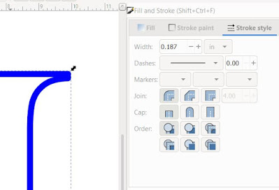
Now, if you don't already have the Fill and Stroke Menu open at the right, you can find it in the second row of icons at the top, over near the right end, above the Width and Height:
Clicking this icon will open the menu on the right. It's a great menu panel to keep "docked" over there. Here, it will open on the Fill options. Click Stroke Style. This is a fun menu!! Play with the style options  for a bit, but come back to solid. You'll also want to consider how you're going to assemble this. If you're using the 0.125" (1/8") foam circles, you'll want to set the stroke width a little bit bigger. I'm trying 0.187" (3/16") but I won't be cutting this right now. I'll report back later how it worked. You can also adjust how the stroke goes around corners (the first option; we don't need to worry about the Cap or other options).

This is the very topmost layer. In my original project, I put the name on this layer too, because it helps hold the frame together. Depending on your letter, you might not need to, and you can keep this layer just as the fame. I'm going to add the name to this layer today, but before I do, I'm going to Ctrl + D to duplicate, and move that to the side. I like having duplicates! Also, now is a good time to save.

For the name, I used the Jokerman font. This is an old font that is available from different sources. I have not paid for any font I use. Many are the weekly free fonts from Font Bundles and Creative Fabrica. Search around, always try Dafont and there are other free font websites. If you want to sell items, make sure you have the Commercial License version/permission!

Okay! This looks much different than when I used it for "Nya". Let's see the uppercase letters:
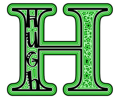
To get a variety, I'm going to use lowercase u, uppercase G, lowercase h. That's alternating, so there's a bit of a rhyme and reason to it. I do that within the text box, then I do Path--->Object to Path then Object--->Ungroup. Now I can select just the u and make it a bit taller. The h already is the same height. 

We need to do some alterations though. I don't like those floating dot and slashes. I'm not about to place them individually. So, open up the Nodes Editor, select the letter, drag a box around the nodes of the dot, and hit Delete. The slashes take a couple little boxes, or select each node with the shift key down.

Good time to save! Get in the habit of saving frequently. I just save as an Inkscape SVG while I'm still working on it. 

Start placing the letters where you want them. If they are being jumpy, you might have your "Snap Tools" on. See the grey icons:

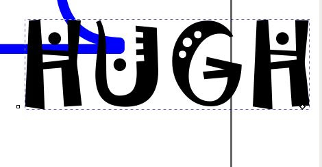
Selecting the one on very left will turn them all off. Now you can place the letters anywhere. You want a small amount of the letter to touch at least one side of the frame. For a letter like "I" you can angle it, or choose a different font--you don't want the letter to fill the whole width and you can't tell it's an I. To angle a letter, select it, then click again and the corner arrows with change and you can rotate now. I changed the letter colour to blue so I can visualize what it will look like when Unioned.

You can't use Align and Distribute, so you do have to eyeball the placements. I'm going to look at the bottom 'h' a bit more. 
See the second bar down on the left, and where the right leg meets the bottom? I don't want to enlarge anymore, so I'm going to alter those nodes. No one will know! I select N on my keyboard so the Node Editor is activated, then click on the node at the bottom corner of the right leg of the 'h'. I pull it down so it's in the bottom piece. I also noticed the 'u' had a little piece to fix up. Zoom in and make it your version of perfect. Then save!  

Then select all the items (each letter and the frame) and then, Path--->Union. It will blink and weld itself together. To check, go to View--->Display Mode--->Outline. See if any lines overlapped. If so, check at the bottom to see if any of the items are not paths. If your letters were a different colour, they will change, so the whole item is one colour.  Save!

Now duplicate it and put it over with the frame duplicate in case  you need it later. 

Select your welded letter, duplicate, change colour, page down (just like the other tutorials), then Path--->Outset. I clicked it three times:
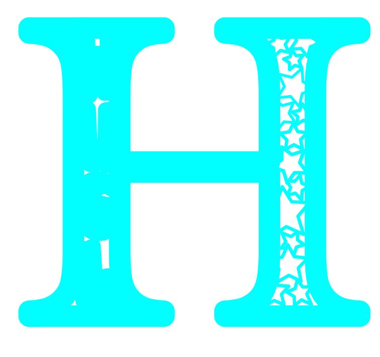
If you look closely (click on the picture to open the picture viewer), you can see the slash in the top H and the big circle in the G still have a tiny bit of white background showing. I was hoping for more, like in my original post. I think this is due to the size difference of the original letter. This letter is quite wide compared to the N. I could go back a few steps and enlarge those little circles but I'm moving on. I'm going to create one more layer of this. 

Move the top layer aside, then the same process: Duplicate, change colour, page down, outset.
In the bottom 'h' there is a tiny hole that's not worth cutting. I zoom in, and use the Node Editor to eliminate this and any other random little nodes (just like in the other tutorials). Check your second layer too while you're at it, and then....Save!

Make another layer: Duplicate, change colour, page down, outset. Move the top layer out of the way. Check for useless nodes. Now this layer, we're going to get creative and fill in the white area that we haven't used yet. In my original design, I simply used circles. You can change the stroke size; you won't likely need to use the foam tabs. Make them with no fill. This time, I'm going to try stars! Create a bunch of stars of a variety of sizes, in the general area.
Spread them around, enlarge, shrink, rotate, etc. If you notice you want a point just a tiny bit bigger so it touches something, go Path--->Stroke to Path and drag the node. If there's two overlapping and a point is showing inside another star, same thing. Once you're happy, click on each star (I do about 4 at a time), and Path--->Stroke to Path.
Once they're all in place, and all are Paths, drag a big box around it all and Path--->Union.

Now, we need another layer! You know the routine now: Duplicate, change colour, page down, outset. Move the top layer aside and check out the nodes on the next layer down.
Here, I've already cleaned out a bunch of tiny cuts. Just click outside the letter box to see what's there, then click inside to show the nodes (use N on the keyboard) and compare. Don't change any shapes, just eliminate cuts that would be really tiny.

And make another layer and offset. Say it with me: Duplicate, change colour, page down, outset. I've been doing three outsets for each layer. Move the top layer aside. Save!

Clean up any insignificant nodes. What do you think? One more layer, or fill it in for the base layer?
There's still white showing in the new layer! We could have ended it there, and filled it in, but let's go one more, which we will fill in for the base.

The final layer only had one tiny spot I had to take out the node.
Stack up your layers again (if any got out of order, select it, then page up or down as needed), select them all, then Align and Distribute horizontally and vertically.
Stand back, and admire your creation! YOU did that! Now look again and be critical. I wasn't happy with how the name, especially the H blended in. The inner part between the H and the u seemed to make a cross. I was thinking of going back to the turquoise layer and filling that in.

I decided to play with the colours instead, making sure there was much more contrast between the very top layer and the next layer down. In real life, there will also be an actual difference because of using foam tabs to separate them. If you're having trouble picking out each layer to select it, go to Object, then the first heading down, Objects. This opens that menu at the side, and you can go through each layer one by one. 

*These are NOT really layers in the graphic design world. However, if you sent this to the Cricut and cut it, each of these colours would be a layer of paper*


Draw a box around it all, and group. Check the sizing. Will it still cut on your paper? Remember that you can't cut the full size of the paper. Then Save as a plain SVG and go to your Cricut! You did it! Can you believe it? I couldn't when I did it LOL. You can also do this with other shapes besides letters. Have the outline of a heart? A house? A pumpkin? You also don't need to do filler shapes like circles, stars or squares. You can use swirls, drawn with the Bezier pen! 

This item started with a clip art of a horse head:
Pretty much the same process was used. There's only 5 layers in this design. It was a real learning experience though! I still haven't got it cut out!


In the next tutorial, I'll go over how to use a geometric design over the item, rather than filling in with shapes. Let me know what you create! Share on Facebook and tag Tracy Kyla or email me tracykm at yahoo dot com!