Once I entered the Cricut world on Facebook and YouTube, I kept hearing about Inkscape. The design software you use with Cricut is good, but has limits. The biggest one being that you save your projects to Cricut's servers--you don't save actual files on your own computer. There is no way to access them outside of Cricut. No way to share them, or sell them (there is a way to share within the Cricut website). If you change brands of cutting machines, you can't access these designs in their software. If you create something really cool and want to use it in different formats (printed, for example), you're out of luck. It was time to learn Inkscape for myself, and not rely on Hugh for everything.
I had watched random videos of people using Inkscape to do things with the Cricut. However, without knowing even the most basic things, I was pretty lost. My graphic design experience has been limited to Windows Paint LOL. I was told about TroyTube's tutorials, so I went with them. This link takes you to the playlist of Inkscape tutorials. He has lots of other videos on it too, but I followed these and it was a great progression. Note that he is using an older version of Inkscape. If something doesn't seem to work, take a look at some newer videos that show the difference between the versions.
This wasn't one of his challenges, but I was just playing around using what I had learned.
I was impressed with how easy it was to create this pumpkin. I didn't finish the challenge with the Starbucks logo, but I got the idea of what I was doing.
I started seeing all these layered designs and I really got interested in them. I found
this video and wondered if I could do it in Inkscape. So cool! I'll show more of these layered items in a separate post.
I found TJ Free's YouTube channel and
Inkscape tutorial playlist. It's not geared for the Cricut but goes into more real design elements. There's a lot to go through and you might think "when will I ever use this?" You may never use many of the features, but until you get into doing things, you just won't know. Although you can follow along with the tutorials and do what he's doing, you'll have to use your imagination on how apply it to Cricut designs.
The first non-Cricut thing I created were these signs for the students and hubby working at home. The one above is for Lucy and is in the Queen's tri-colours, along with a tiny bit of engineering purple.
This one is for Megan.
Then, I really started going hard core graphic designer. Logos by Nick is another great YouTube channel with lots of how-to videos for Inkscape. I followed his
tutorial for creating neon text!From a distance, there's not much too it. Up close though, you can see all the details, the multiple layers, the use of gradients and opacities.
A quick door sign for the hubby.
Although I don't expect to have many uses for neon text, I wanted to practice a bit more so I solidify what I've learned. I decided to make this, and sneak it onto the desktop computer as a subtle hint for Rob. It worked! New knives as an early anniversary gift.
This is what it looked like before making it the desktop background. I had to make some changes to the grandients so it would work well with the two rows of text.
Another group of videos I watched was about creating line drawings by tracing pictures. The first try was a picture of Megan, which I haven't finished. I've reached the point where I've got several design projects on the go LOL. At least they don't take up space like knitting and sewing! The house was the cottage we stayed at with the extended family. I just did another one of another house, my brother's first house! This one went much quicker! They love it! I did include their actual address, but I edited it out to post it publicly!

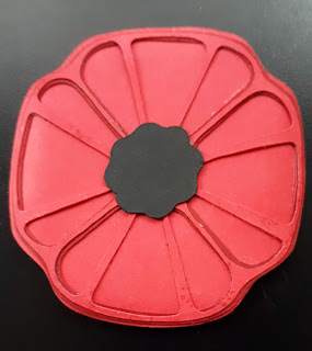
I wanted to create a simple layered poppy (I recently blogged about it, so scroll down). It was hard at first, and then I pretty much started all over because it had gone too far wrong and the "spokes" needed to be thicker. Then I had some real headaches about how to size/scale it in Inkscape so it keeps the right size when it imports into Cricut. Ever since doing the neon exercise, I've been looking at everything I see online, in print, etc with new eyes. I watched a lot of Logos by Nick's videos and so much looked so complicated. Having to start with basic shapes to make anything; layer, duplicate, difference, union.... I look at this poppy and see a circle with four dimples. I started with Inkscape tracing a photo of a plastic poppy. For the second try, I sliced the poppy in half vertically and mirrored it. That gave me some symmetry but I know I need to view it as four lobes. I can't help but divide it by the petals (pie shaped pieces) but from a design perspective, I'm not sure if that works best or if it should be divided vertically and horizontally. When I find some free time (LOL), I will play with it some more. I also just bought some pens to use in the Cricut and realized I could also do this poppy with drawing lines, instead of cutting those fine spokes.
I highly encourage anyone who uses a Cricut to learn how to do some simple things with Inkscape. Being in charge of your own SVGs is huge. Design Space has a lot of issues, and it is necessary to use it to cut designs, so doing what you can outside of Design Space will give you added security.


No comments:
Post a Comment