Wednesday, October 21, 2020

Bottle Labels

 I love making sauces, foods, condiments, etc from scratch. With all the extra time this spring, I started watching a lot of cocktail making videos. At the same time, Lucy was drinking cold brew coffee. She needs simple syrup for that, and I didn't realize how often it's used in cocktail making. I just never seemed to have the right containers for sauces. I found some on Amazaon and got my creative juices flowing!

Some of the first sauces--had to use the Brother label maker. Yawn.  Once I felt comfortable with the Cricut, I got started on making some with Oracal 651 permanent vinyl. 

Honey syrup! I made the yellow as little pieces, layered on all together. Next time, I'd make the whole body yellow and lay the black over it. I didn't know about creating a base layer.

Not a sauce or syrup, but had to fancy up my water bottle. It says "It's just water...I swear"


I learned how to make sour mix! Again, I made this with the black going over the yellow. I should have made the black base and have the face cut out of the yellow so the black shows

I had a hard time finding a free image for this. It's been through the dishwasher a few times, and only the tip of the single garlic clove is having issues, but it did right when I put it on.

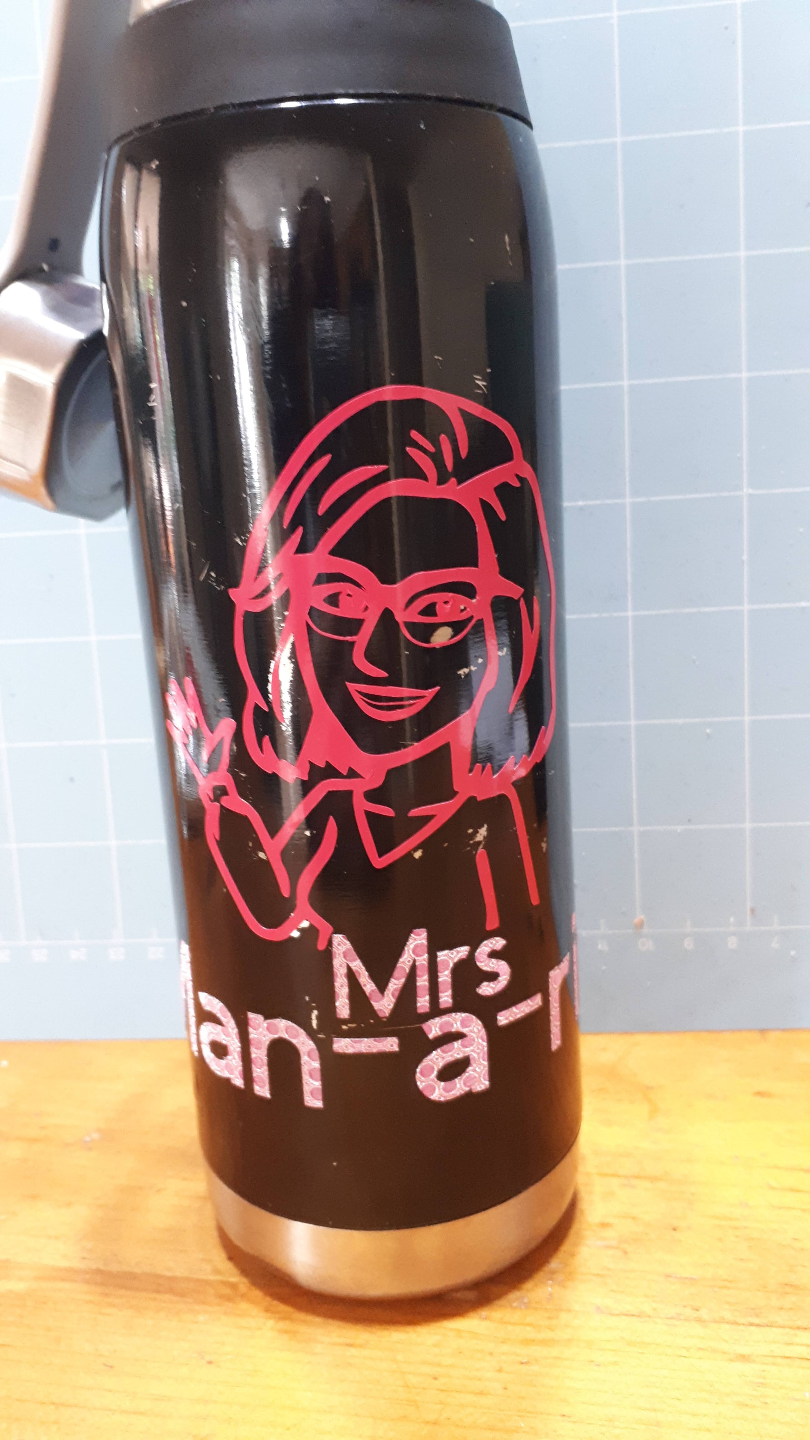
I had seen videos where people made car decals out of their Bitmoji images. Fun! When I first tried, I couldn't get the bottom of my glasses and the teeth thin enough. I sent it to Hugh and he fixed it up. My name is spelled as how I write it for the kids when I work "Mrs Man-a-ring".

I made some blueberry sauce. No real reason, except I had some blueberries no one was eating. It's kind of too lumpy for cocktails but it's really nice on ice cream, yoghurt, peaches.  I almost made it in blue but then realized blue on blue wasn't smart.

I had bought a huge bottle of Thai Sweet Chili sauce from Costco.  It was so annoying. As soon as it got low enough, I put it in this jar (16oz).  Some of the letters slid around. Don't know if it hadn't dried enough before I stuck the label on, or what. This also happened with a bottlle I used cheap dollar store vinyl on. 


Saturday, October 17, 2020

Simple Layered Poppy

In Canada (and other Commonwealth countries), Remembrance Day is observed on November 11. It is a solemn occasion; often with cold, dreary weather appropriate to the seriousness of the day. To show our gratitude and thankfulness, Canadians wear a poppy on their left upper chest. We acquire these each year through donation boxes at work, stores, or volunteers at stores and events (such as veterans or young cadets, or other Royal Canadian Legion members. The RCL is a network of community centres for veterans). We are expected to donate each year to receive a new poppy. They are notorious for silently disappearing from our coats and shirts, and for sticking young children with the straight pins. Schools usually receive poppies to hand out but I don't know if they take donations. They also have had stickers in the past few years.

Poppies are a symbol of remembrance. They aren't intended to be used as decoration, except as applicable in events of remembrance.  Poppy items are not to be sold for profit in any way. When you get a poppy through the Legion, you are not "buying" the poppy; you are donating to the Legion and the poppy is a token of appreciation. I strongly urge you to donate to your local Legion, or other veteran's centre if you make poppies with this file. I will be.  If you see someone selling items on Etsy, or elsewhere, advertising that they are "donating $1 for every item sold" or "donating a set amount of profits", please be cautious and consider making your own donation directly to the Legion. 

I created this simple layered poppy after some members in a Facebook Cricut group expressed an interest. Many were British, and I don't know if they have different standards about the poppy there. I had made a few layered designs and really enjoyed them, and wanted to try designing my own.  Using a poppy shape was a way to get me to actually do it, instead of saying "some day". It wasn't about making a fabulous poppy; it was about learning to design.  In some aspects, it's not too hard, but some parts were annoyingly challenging (getting it to import the right size into Design Space). 

This poppy is intended to be made at 1.9" across (and high), the same size as a lapel poppy.  It should import into your cutting program (Design Space, etc) at that size, but I am new at this and had some issues.

Layered paper is obviously not suitable to be worn, though it could be laminated. It could be made in vinyl to make a sticker. That would be good for people with special needs or children who might struggle with the use and safety of a pin. Sometimes you want a poppy but the plastic ones with a pin aren't suitable. Some people are against the waste and non-renewable resources used in plastic poppies. The design could also be made larger for other uses. You can also cut just the solid red piece and the black piece for a more basic poppy. This would be good for teachers who are having their students make wreaths or items for ceremonies. 

The poppy has 3 red layers, though I cut mine with the top 12 spoke layer in the same red as the solid bottom layer. The middle 4 spoke layer is in a darker red. Each layer is smaller by only a very tiny amount! It's intended to add a bit of depth, a shadow effect. You could skip the 4 spoke layer as they are tricky to line up accurately.

I cut the top layer using Intricate Cuts for Cardstock (Cricut Design Space, using the Maker). The design is not symmetrical, so I recommend you carefully lay the pieces out with the same orientation as they come off the mats. I am very much still a beginner at designing and using Inkscape! I used spray adhesive, no foam dots to make the layers elevated. I also curled the edges under a little, around the dental pick I use for weeding vinyl, and pressed the middle inwards. It's hard to make paper replicate what plastic can do when it's being molded while hot. 

Poppy SVG

Please share with me if you make this poppy. You can email me at tracykm at yahoo dot com, or find me in various Facebook groups (as Tracy Kyla). I'm also on Instagram at tracykmvetzal. You can also comment here. And again, do not sell items made with this poppy.

Edited to add:

I made a large poppy for my front door. Sized for 8.5"x11" cardstock.

I taped some red ribbon to the back, with painters tape.

To add to the middle, I took the black piece, enlarged it slightly and cut it in green (Canadian poppies used to have green centres). Then, on the black piece, I centered the text, and sliced it out of the black, and cut it out. I nearly lost the inners of the 'e' letters. Before taking it off the mat, I made sure the inner bits were in place, then placed painters tape over. I carefully pulled it off the mat. Then I turned it over and weeded out the letters.  Then I used spray adhesive and sprayed it well. I placed it down over the green and burnished it well. I carefully peeled off the painter's tape, making sure the little inner bits were in place still. 


At this size, it was a bit easier to line things up but I still managed to turn a layer over or something and had to spend some time making sure everything was lined up. I'm working on fixing the design so it's symmetrical. I used  two colours of red

I've been wanting to do more with pens in the Cricut. I got some Staedtler Triplus fineliner porous point pens, 0.3mm because Jennifer Maker shows them working in a video. However, they kept popping out. I wrapped it in painters tape and it stayed put. I re-worked the file so it would have draw lines. I felt that the 0.3mm tips were too fine for what I wanted (a thick line around the outside and four spokes), so I bought some Crayolas Super Tips because I had read they work. Well, they're too big for the Maker (they apparently fit in the Explore Air 2). I think they will work if you take out the inner piece. So, I ended up using the Triplus and colouring in myself.
Because it's not three layers with glue, I was able to shape it more, indenting between the lobes and curling the edges back. I taped a safety pin to the back.

Lest We Forget

Friday, October 16, 2020

More Yarn

 I'd been working on a blanket with the neon brights yarn I bought while at the cottage in August. Although I had made other blankets with less than 454gr (1 pound) of worsted weight yarn, this time, it didn't seem like it was going to happen. 

Don't you hate it when you cut yourself right where you carry the yarn?

It looks a little funny down at my feet. You'll see why when the blanket is finished.

I really didn't want to rip this out. The gauge was fine, I was only an inch too wide, which wouldn't have given me enough yarn to make up the length I still needed. 
I remembered in a Canadian crochet group on Facebook that a few people had bought yarn from Cambridge Fibres, the company that puts together these mill end bags. So I googled, and sent them a Facebook message explaining my plight, and do they have any of this yarn left. 

Yes! They made me a deal. They suggested I get more yarn to make the shipping a better deal and asked how much I wanted to spend. I said I'd be fine spending up to $25. They sent me a picture of a couple different options, I picked two, and a few days later, all this colourful goodness became mine!

Yarn In:  5115gr + 1362gr = 6477gr
Yarn Out:  8915gr
Balance: 2438gr gr more OUT than in!
Costs:  $25 + $115.68 = $140.68/290 days = $0.48 per day


Friday, October 09, 2020

Getting the Family In On It

I have had an idea for a "personal logo" for awhile but Pinterest and Google searches hadn't revealed the right thing. I want this to create business cards for supply (substitute) teaching, but also for personal use. Something that would represent me, on a business and personal level. I can't separate them! Once I got the Cricut, I knew it had to be created. Co-incidentally, Hugh was learning graphic design programs. I'm sure he could help me out!


I found a treble clef image. Just finding a realistic, classical treble clef was a challenge. Then I had to find a compass rose. Something bold but not modern, classic but not fussy. 


Done! Sent them off to the wonder child, and waited. Like, seriously, only 30 minutes. And then this appeared in my in box!


Like, how the heck did he do that?! I think this was the second version though--I had him add the N and make the points extend into the treble clef.

However, when I took it into Design Space, it wasn't looking right. The compass got thick.  I tried playing around with it

I got it broken down into it's parts, but the compass had a white background instead of transparent. 


And to make it fit in the clef, it goes over the inner swirl. When I go to cut it out though, I need that overlap gone, and I need the background transparent. I couldn't figure it out in Design Space, and I didn't want to harass my child again. He was still in the early stages of learning Illustrator. The original design he sent looks fine as a print image, it's just not ready for cutting and he's not familiar with what a Cricut does, and doesn't live here, so it gets complicated trying to explain. We'll come back to it later. 
Next up was this Canadian Bingo. I saw it in a group and thought it'd be fun for my niece who is a new Canadian. I didn't really like the title font though and I needed it in a format I could use. I tried in Word, using a table, but it was pathetic. Enter Hugh the Hero:

It's a little challenging to see, but the maple leaves are a few shades of red. There's a deer head at the top.  I printed on regular paper, but it was kind of washed out. Rob suggested printing on photo paper, so I did, and it looked much better. Megan helped me pick out a frame, and Rob cleaned it and assembled it. 

The next thing (actually started earlier) was the logo for the community band I'm in. I want to be able to make bumper stickers.


There's a lot of detail that just doesn't work for cutting out in vinyl. A couple years ago Hugh re-did the design so it could be embroidered on to shirts. It's mainly the blue and yellow inner, with a black outline and a silver banner but not the bottom banner (I think....not going to go check).

I had to do some disassembling. I notice the top of the shield is a bit jagged.

The different parts of blue (and yellow, etc) had to get "attached" so they would cut like that, instead of individual parts. 

There was something about the letters...I decided I wanted the black on top so I welded the shapes over the letters because I couldn't "contour" them for some reason. 

I learned about registration marks, and used them. I learned about layering with parchment paper, and did that. But the black outline was too thin and there was a black cross to divide the segments but it was also way too thin. It easily got skewed. I had issues with getting the text off the backing. One thing after another. I ended up putting this on the inside of my work binder, but it's textured so the tiny letters don't really stick. Rob tried to tell me to make the whole thing black and put the parts on top, but I was frustrated and didn't really understand. After some more videos and projects, I clued in. I re-worked it so the silver also includes the shield. Then there's a solid black layer, and then the 4 segments on top. The letters...I can't remember...I think they are cut out of the colours so the black shows.  I haven't tried re-cutting it yet. 

Megan figure skates, as evident in many blog posts. I thought I could easily whip up her club logo into a file to make bumper stickers, water bottle labels, etc. Just follow the videos! It started out fine but I ran into troubles so Hugh rescued me again. I don't understand how a 3 colour image could be so difficult. A big issue was the quality of the initial image. Neither of us could find a good one. In the end, this one should work. On the water bottles the club handed out, it's just one colour--the blue, and the rest is transparent. Boring! But easiest when mass producing.

Next up---a Bitmoji image! I saw several videos on how to do this! It was going really well, but I had issues with my mouth and the thin line of the bottom of my glasses. Hugh fixed it and wow! It's adorable! I love it! I put my name as how it's pronounced. This makes it harder for students to search for me on social media LOL. I put it on my old bottle as a test. I haven't gotten around to putting it anywhere else, but I think my truck needs one. 

Up next will be more projects I did without help LOL. I think I got ahead of myself with the band logo and I needed to step back. I got more into learning Inkscape, and doing some paper projects. 


Thursday, October 08, 2020

A New Craft!

 It happened. I started a new crafting journey. I've always been interested in "personal doc(ument) cutting" machines. For awhile, I was seriously considering getting a Brother Scan N Cut. It didn't seem to be available locally and seemed to be the shy, smart kid off in the corner compared to the Cricut and Silhouette machines. Everyone knows about Cricuts and Silhouettes, but not many knew about the Brother. As soon as Rob started looking at them, he declared that we should get a "real" vinyl cutter, not any of these small ones. Of course, he wasn't about to invest the money in one, or set it up (some are big!), etc, so the idea just lingered. The home machines are pricey enough that I couldn't just rush out to purchase one. I mean, I've been putting off getting a new camera, which would have cost the same or less. 

Schools shut down at the start of March Break here. It was initially for two weeks after the break. Then it got extended....a few times...I knew I would be getting some money back from a cancelled trip, and a camp, and thought maybe this would be a good time to indulge and treat myself. I watched the prices for the Cricut Maker at Costco and Michaels, and then one day Michaels had a sale with the lowest price I'd seen (I've been getting their emails for years so I casually kept informed on the price). I was able to place an order for curbside pick up locally. There seemed to be very few machines available! I picked it up, plugged it in, and got started. Nervous but excited. I like learning things! But I also know there can be a lot to learn, and a lot of ways to mess up. Which I have certainly done!

Set up went smoothly. I tried to do the first, intro, project, and couldn't find it! I found "unboxing" videos and they were able to find it easily. I did find it but not with the kite cut from fabric. Eventually I figured it out.

I don't think I took a picture of the card, but here she is, all set up. Well, not really. I realized there were no outlets close enough here.

I didn't get any additional supplies but I used to do scrapbooking, so I thought I would have what some materials to get started. I started looking at the projects in the Cricut software and realized I had very little to work with. I did find this red cardstock and this neat maple leaf design, so I gave it a try. I didn't get it sized up properly and a tip got cut off.


These are the bits that are left on the mat. I thought they were almost as good as the paper that got cut out. But what to do with them? I did get some clear contact paper from Dollarama and tried to get them off the mat all together....but the contact  paper stuck to the mat, it got wrinkled, etc. I then put some on the backside too so the stickiness was contained.
So now what? I trimmed it close (because I got a grease spot from dinner on it), but then what? I decided I'd put it on a card for my niece who just got her Canadian citizenship.

I went to Dollarama to see what I could stock up on. They had pads of printed cardstock that was a great deal! And a bunch of other assorted things I thought I could use. I even needed just plain old glue.
Father's Day was coming up, and although I don't usually do much, the kids don't either--and especially now that they aren't in elementary school, making gifts. Lots of projects out there. I found this card design, but it needed an envelope. I found an envelope but wanted to try sprucing it up. I took a heart, and welded a star into it. However....I had taken the score lines off because I don't have a score wheel, and so I wasn't paying attention to where the flap gets folded and the heart is too low. 
 

I added slits so I could tuck a solid paper behind. The design was totally not mine, I wasn't ready for that yet.

I was making freezer meals for my eldest to have on hand while living away. I bought a small Crockpot and thought I should dress it up. I don't think this was the first thing I cut from vinyl, but I had some challenges.

There's so much to learn. Design aspects, materials, just how to use the software and machine. It's hard to know what's a user error, and what's a material error or a machine error.

I knew I had to shrink the letter spacing with cursive so the letters touch, but didn't realize it's a challenge to cut the thin lines in vinyl


It's so not me, that makes it even funnier! I still need to do my Instant Pot!
I made a simple two layer decal for Megan's Airpods case. Originally, I wanted a small M inside a big M. Kind of like an outline. I couldn't figure out how to do it though (tip:  you can't, using Cricut Design Space, you have to do this--offset--in other software).

I went back to paper for the next item. I thought it would be nice to have a simple gift box pattern. I could not find any that were free, and very simple! I did find this, from Jennifer Maker.  It's adorable, though I haven't done anything with it. It's not as box like as I wanted, but still a great, easy project with good impact.

Back to vinyl.  I have this IKEA plastic cover for in the microwave. People often take it out and leave it on the counter. So I made a reminder to put it back in if you take it out.

Some people say not to use items with vinyl in the microwave. At this point in my life, I've probably gotten enough plastic poisoning that I don't know if this little bit of vinyl, for the little amount of time the microwave is used, is really an issue.


I was getting ready to deliver the Crockpot and meals, and I was including some cornstarch for making slurries to thicken the meals. I wanted to make a label for the little jar. The font I used for Cornstarch had extra cuts between all the letter segments. It did go on fine though. The instructions, in blue, were a different story. I think I used a different font. I made sure it was thick, but the cut letters kept getting lifted as it cut, so it was all out of line. No way to get it back in proper order. So I just put the cornstarch label on the jar and wrote out the instructions. Not sure what happened here. 

The kid also needed a birthday card. Jennifer Maker came through again, with this 3D card. 

 
I didn't have spray adhesive, just Dollarama clear glue and the card kind of looks like a 1st grader put it together. It doesn't really "pop up" like in her video. I had a hard time figuring out where to score since I took off the score lines.  Next time, if they're not visible when done, change to draw lines, or make them skinny cut dashed lines.

I wanted to move on to more complicated things. Our mailbox was looking a little sad, so Rob painted it and I created this monogram. However, when I applied the vinyl, despite having marked where to place it, it didn't go on straight. Rob couldn't tolerate it, so he carefully scraped off the curlicues.

I love it, though I wish it was fancier LOL. 

Something else I got into this spring was cocktail chemistry. On our cruise last fall, we had our first drink package. I tried to try a lot of different drinks, though I didn't even know what I'd like. I found some YouTube channels that are all about cocktails, and got into making my own syrups. I bought some jars off Amazon, in two sizes, and realized very quickly that I need to label them better than with a Sharpie! This one is honey syrup. I'll make another post with all my bottles. With this one,  the yellow bits are individual, but get applied as one piece. If I ever do this one again, I'll make the yellow a single piece and put the black over it.

My FIL wanted his bicycle back and since Rob had to do a bit of fixing up, I added a decal. I wanted to include his cell phone number but got told no LOL. 

I started to make more complex designs after this, so I'll make different posts for those. 

What I would tell another Cricut newbie---find a YouTube channel with beginner tutorials. Watch some more advanced videos too, but don't get ahead of yourself. You really do need to start with some basic projects to learn how your machine handles different materials, and how to put things together. While a 4 layer vinyl decal looks not that difficult when you see an expert doing it on YouTube, keep in mind they've been doing it a long time, and the power of editing  is real.

 One downfall with Cricut is their design program has some strange deficiencies. In any FB Cricut group, when you ask how to do somethings, people will chime in that you can't, you need to use another program like Illustrator or Inkscape. I decided to get on the Inkscape bandwagon. It's free, and surprisingly powerful. Overwhelming at first, but again, watch tutorials for beginners, especially ones geared for Cricut users. The best thing about using Inkscape is that you can save your files as SVGs. This means you can share or even sell your designs! In Cricut, when you save your project, you're saving to their server. You can't take it outside of Cricut. You can share with other Cricut users, but I believe they have to have the same fonts, etc, installed. If Cricut has an off day, you might not be able to access your projects. Learning Inkscape has been really fun. I've created all sorts of non-Cricut designs too! Sometimes I get stuck, and I have to email the design off to Hugh, and he can use it in Illustrator and fix my mistakes and send it back. You can't do this with Design Space. I'll post more about Inkscape later.