Monday, February 22, 2021

Moving Along

 I posted a few posts ago about casting on way too many stitches for a blanket.

I cast on the appropriate number of stitches and got going. It's pretty quick, since there's 5 rows out of 6 that are just knit plain!
The colours seem much more vibrant in these pictures. I don't notice a bright yellow stripe in real life!


Wednesday, February 17, 2021

Quick Knit

 This was one of those projects that seemed like it was taking forever, and then suddenly, it's done. 

I was browsing in my yarn store (what my family calls my stash) and found this ball of soft yarn.  I thought the colours would look nice with my two new winter coats--one bright pink, one dark wine. I used to have a lot of winter accessories in wine/plum/marron, but they're quite worn, or even no longer in my bin (even though I still have the coat they were made for). 

I knew from the roving style, and a quick Ravelry search, that the yarn needed a stitch pattern with some structure, to help it keep from pilling. My first thought was a nice squishy Brioche scarf. Brioche takes more yarn than regular ribbing though, and I wasn't sure the one ball was going to be enough. I did find a mobius neck warmer in the projects that were done with the yarn. It linked to a Purl Soho pattern for a Fisherman's Rib scarf. The woman had given it a twist before sewing the ends together. She says she used one ball, and cast on 21 sts. 

So that's what I did.

It seemed to go so slow. Not very long rows, but for a thick yarn, the length sure didn't grow very fast.

And then, all of a sudden, I was nearly at the end of the ball, and it was not long enough to wrap twice around me snugly (I didn't want long and drape-y; I wanted it close fitting). I found this ball of Lopi in my "store". The colour worked. It is 100% wool, and a bit scratchy, and will felt if washed/dry wrong, but the main yarn said handwash too.  I ripped back a ways, then did chunky stripes where I used one yarn for one row, slide the stitches back, used the other yarn for the next row (but having to purl in the stitch below rather than knit in the stitch below). It was turning out one colour on one side and the other colour on the other side. Then I accidentally switched for two stripes. Then I went back to thick sections with one colour on each side.

I did manage to figure out one row stripes (the green and wine section)

I figure once it's wrapped around my neck twice, it all gets mixed together

I did end up having to do a bit at the end with just the Lopi. Then I gave it one twist, and grafted the start to the end (I had done a provisional cast on). I didn't do a great job; one side it blends in, the other side has a ridge.

You can see the two rows of Lopi  here, but over all I think it blends fine.

It works well with my coat. I can wrap it twice, and pull it over my nose, or I can loop it once and it lays pretty flat inside my coat. 

Yarn In:  0gr
Yarn Out:  156gr + 600gr = 756gr
Balance:  756gr more OUT than in
Cost:  $0, $0/day


Sunday, February 14, 2021

Happy Heart Day

 I don't think I've ever decorated for Valentine's Day before. I keep my snowmen and snowflake stuff up, but I don't think I have anything else. So, since I have the Cricut now, I decided it was time! I wanted to do a layered heart. Should be simple to find a SVG, right?

Nope. Well, yes, there are some out there. They either cost money, or the website caused my virus protection to stop me, or the link was dead or just not what I wanted. 

I finally found this one:  https://linkedgovinyl.com/product/3d-layered-heart-graphic-free-3d-svg/  but of course, I couldn't make it with just four layers! I took the third layer, duplicated it, then created an outset. Then I had to enlarge the bottom layer too, increasing it by the same number of outsets (Inkscape).

I thought I had deleted tiny cutouts, but due to the smaller size (8.5"x11"), I could have simplified it a b it more.

Here are all the layers. Adding the extra layer just filled it in a bit. It would have been fine without it, but I'm of the mindset, the more layers, the better LOL.

I did have some issues cutting this. I used the intricate cut setting. I don't know if the blade had some residue, or is getting worn, or if it was the red paper (different colours cut differently). I had to use my little swivel blade to cut parts out by hand.


I found some red ribbon in my sewing desk, and along with some painter's tape, I have a new front door decoration! Simple and sweet, just like me.

Tuesday, February 09, 2021

Woolies by Request

 When Christmas lists were being created, Lucy asked for some custom Tricolour mittens. I wrote about that HERE, and choosing the Topsy Farm yarn. I finally got started on the mittens just after New Year's. I used the schematic and math from Ann Budd's "The Knitter's Handy Book of Patterns".  This is a great book! It's even better if you actually do a gauge swatch LOL. The cuff went fine, but as often happens, I had gotten almost all my thumb gusset stitches increased, but still needed more height to the gusset.  Instead of 3 plain rows, I did 4 or 5 and then the next increase. 

I almost always knit my mittens two at a time on one circular needle, for the very reason that if I need to alter the pattern, I don't have to try to remember what I did for the second, or look for something to scribble on and then try to interpret my scribbles for the second mitten. 

At the thumb gusset, to continue the body, I cast on about 3 or 4 stitches. Then I decrease these out over the next few rows. This just gives a bit more ease to the gusset. 


I ended up knitting the top decreases a couple times before I got the length right. Maybe I should have just done some math LOL. 

I also knit the thumb maybe....three times? I just couldn't get it to look good. I had increased a lot of stitches in the gusset but the thumb didn't need that many. Decreasing them out make the thumb look wonky. When I start the thumbs, I pick up extra stitches from where I had cast on for the main part of the hand. Those also needed to get eliminated.

I soaked them in the sink with some Soak. I think I might have put them in the dryer for just a little bit to get out some moisture. The Topsy Yarn does soften up with washing, but these are definitely not merino. They're hardwearing, rugged, see you through a Kingston winter, mittens. This also happened this past week:

Would have been cool if she was a '23 but we've got a '22 there now (in another program...who seems to be on a 5 year plan...).

My kitchen scale seems to be malfunctioning, so 80gr is the best answer I have for the weight. Which means I have enough left for two more pairs of mittens if I do other colours as the dominate colours.  That means $9 for a pair of handknit wool mittens. Pretty awesome. I think if I do another pair (I wish her birthday wasn't in November, but actually, that gives me some time), I'll make them double layered, and use a softer wool on the inside. Such a spoiled girl, she is. But at the same time, it warms my heart to know that she values wool mittens, and that she wanted ME to make them.

Yarn In:  0gr
Yarn Out: 83gr + 517gr =600gr 
Balance:  600gr more OUT than in
Cost:  $0, $0/day

I rounded up to 83gr because I had some small bits left after reknitting the cuffs because the stripes were too thick. And, it's my blog, so I can do that. And 600gr out looks better than 597gr. 


Friday, February 05, 2021

Math

 "Do a gauge swatch if you really want to know..."


I say it all the time. 


And, "Trust your gut". 


Well, I DID do a swatch. I just didn't do the math right LOL. I was knitting and knitting....it seemed to take forever to do one row. There seemed to be a lot of knitting scrunched up on the needles. It seemed to be using up a LOT of yarn. 

Finally, I grabbed a couple other needles, and stretched it out.


Oops.


It was supposed to be 35". The tape measure beside it is 60" and the knitting continues past the end of it by quite a bit. 

I have no idea how I messed up the math. I had to consider not just how many stitches per inch I got, but also the pattern repeat and the extra stitches (repeat of 4st plus 3 extra). 

I'm glad I didn't continue any further! Trust yourself! This got ripped and re-started and is flying along now. 

Saturday, January 30, 2021

One Makes a Difference

 I like to have a "purse" project on the go, for those impromptu car rides, waiting rooms, movies where I can't follow a pattern. Starting last summer, it's been primarily newborn baby hats. I've used up almost all from the three large balls I bought in the summer. I'm down to just some yellow. 


One end of the remainder was the dark yellow. I didn't like how it changes from dark yellow to the next colour, so I decided to alternate rows with both ends. It lightened the dark yellow but still left it somewhat of an abrupt colour change when the dark yellow changed. 

I used the technique from the helix hat pattern. That pattern isn't the one that I first used. I can't find those on my blog, but I did find this, from 2012:  

...done using a "helix stripe" technique, where you use at least three colours, knit in the round.  Knit 1/2 the stitches with the first colour, then the second half with another colour.  You're back at the start, and change to a third colour.  When you get to the first colour, drop the third--do not twist--pick up the first, and keep going.  You do not get holes.  The only secret is to never, ever frog back by taking it off the needles. 

I was only using two colours though. You can use as many as you want. The key is that you knit around, knitting the last stitch used with the previous yarn, drop the yarn you were using, pick up the new one and knit on. Do not twist the yarns! Just check that the stitches have the same tension. This method does not create a ridge on the inside. It's really nice and smooth. 

This is just one small hat, but you never know who will feel blessed by it, or motivated to learn to knit, or to make hats for donating. It will go in the bag with all the other baby hats. In awhile, I'll contact someone and have them delivered. 

Yarn In:  0gr
Yarn Out: 500gr + 17gr = 517gr
Balance:  517gr more OUT than in
Cost:  $0, $0/day


Thursday, January 28, 2021

I Knitted

 I had planned to do a lot of knitting while recovering from my surgery.  However, I didn't realize how challenging getting back up the stairs from the basement would be. I knit while watching TV, and sitting upstairs, knitting while watching YouTube, just didn't feel the same. Also, Rob works in the basement, so it wasn't the most pleasant environment to enjoy the relaxing qualities of knitting LOL. 

I did just get one blanket for charity finished. And I love it. I bought this teal ombre yarn in the summer when we were on vacation. A few weeks before surgery I got out the yarn options for the next few blankets and asked in a knitting group which solids should go with which variegated yarns. I knew that the variegated yarns would not be quite enough for each blanket, so the solid colour would stretch it out. One member suggested tan with the teal yarn, to play off the feeling of a Caribbean beach. Bingo. I knew I had to pair it with a feather and fan stitch pattern. 

Certainly not Caribbean beach mood outside now. 
I did the tan ridges at random, never more than two in a row, and never more than two teal ridges in a row. 

Simple garter stitch edges, 5 stitches wide, and 3 ridges top and bottom. I cast on with a crochet cast on so it would match the cast off.

Feel those waves crashing in. 


Such a beautiful yarn. It was a 1lb bag of "Unknown Fibers" from Cambridge Fibers. It had a little bit of a stringy look to it before washing. It almost felt like cotton. Once machine washed and dried, it plumped up and is nice and squishy now.

At least one kid has said not to donate this one!

Yarn In:  0gr
Yarn Out: 500gr
Balance:  500gr more OUT than in
Cost:  $0, $0/day


Thursday, January 21, 2021

Designing Snowflakes

 This wasn't the tutorial I had planned to write next, and I think Inkscape knew it and gave me a hard time. If you've been here awhile, you know that I believe yarn can talk, so it's only rational that Inkscape can pick up on my inner thoughts too. 

(Yes, I'm joking. Though....yarn really can speak to you!).

If you were on social media this fall, you probably saw the "F*** Flake" snowflake ornament. Imagine a word starting with F, creating a snowflake, a circle at the centre with the year in it. I love snowflakes, and knew that the tools in Inkscape should make it really easy to design some. However, finding tutorials and videos on how to do this was not easy. I found a few, but nothing that really gave me what I needed. Then I found this video:  https://www.youtube.com/watch?v=LQqRfMP_hl4 The sound quality is not very good, so turn it up. I also found https://www.youtube.com/watch?v=uwTe0jhOYEU but he seemed to take the long way around on some elements. There's somethings to be learned by watching both though. I realized that watching videos geared for Glowforge, or laser cutters is more helpful for Cricut users than general Inkscape videos for graphic designers. There are things you need to consider for Cricut or laser cutters that you don't have to think about when creating a digital image. 

Originally, I wanted to cut these out with the Cricut, but because of my surgery, this wasn't really possible at the time. Perhaps for next year (which, is really this year, but my years typically follow the school year, so "next year" is September LOL). Since I'm learning more and more digital design, I started getting really creative with these. Let's back up though to a basic image. 

I had intended to cut this one out, but just couldn't get to it. This is what we're aiming for in this tutorial, and then I'll expand on it a bit if you want to just make it a digital image.

First step, for Cricut users, set up the Document Properties like this:
Display units and Custom Size units are both in inches, the custom size is 12x12, and the Scale is 72 in the x window. This will ensure it will import into Design Space at the size you intend it to be. 

Open up the Text Editor (the A on the left side), and either choose your font from the top font menu, or just type your text and then scroll through your fonts on the right side, seeing how it looks in different fonts. I used Amrelia. Do not click out of it or convert to a path.
What makes these snowflakes fun (to me) is all the "swirls", usually called glyphs or swashes. Not all fonts come with them, but the ones that do usually mention it as a selling feature. To see the glyphs, you need a "character map". The one that comes with Windows 10 is pretty useless, as it's so small. If you're using Windows 10, download Character Map UWP from the Microsoft store. 

To use it, scroll through and find what you need/like and select it. Click +Add (towards bottom). It'll add it in the lower window. Then click copy. Go back to your design, and click paste where you want it in your text.

Here's where the tutorial gets tricky. I went back and forth from this step, to the next, and then starting over as I tried different combinations of glyphs. It's not until you rotate it that you can really see how it will look. So don't despair if it takes a few tries.  If there are no letters with hanging tails, you might want to change more letters to ones with glyphs so that the words will connect with each other when you rotate them, for strength (if cutting out). As you do this more often, you'll start to visualize text in different ways. You can always use the Bezier pen to create swashes to connect the snowflake arms in a decorative way.

Also check it with View--->Display Mode--->Outline View. You'll see that this particular font is really skinny! You might want to use the Outset function to thicken it. You follow the same process as in earlier tutorials to create an offset, but you don't need to change colour, or lower it, and then you'll Union it to the original text. 


Once you like your text, use the selection tool, and Path--->Object to Path.  Then Object--->Ungroup (a few times might be needed), then Path--->Union. If you are keeping this digital, you can leave the Union till later in case you want to change something.  However, if you are going to cut this out of cardstock, you want to make sure all the letters are connected somehow. 

Take a look at the outline view, using View--->Display Mode--->Outline. If there are gaps between letters or parts of letters, you need bridges. To do this, you can look at it with the Node Editor and see if any nodes can be moved slightly. Or, you can Union in little rectangles like in the second video I linked to above.  If you want to keep this digital, and have a neon feel to it, you need to create gaps  like Nick does in this video starting at the 3:50 mark: https://www.youtube.com/watch?v=fE-gKcJC8M8&t=12s 


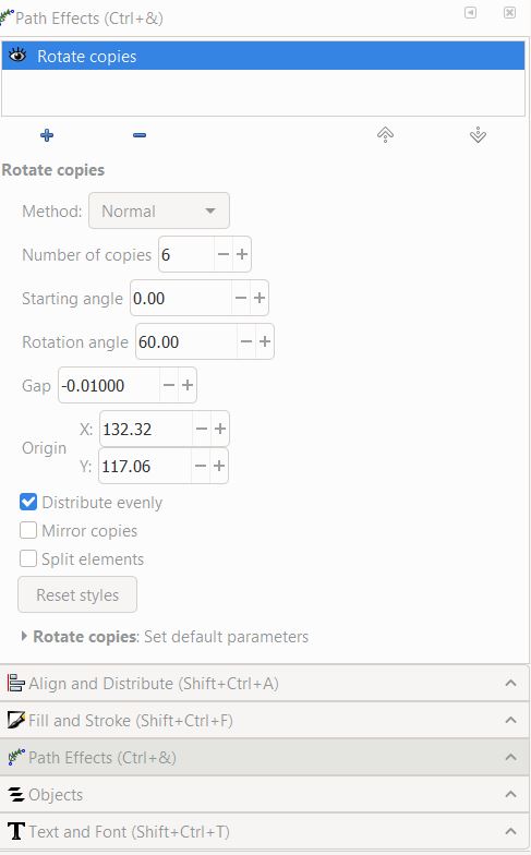
Once you are happy with your text, the fun part starts. Wait! Hasn't this been fun all along? LOL. It's time to rotate! Select your text, go Path--->Path Effects (at the bottom of the list). This will pop up the Path Effect menu on the right. It's a large box with a small + icon at the bottom. Click the icon and the following screen will come up


. Click "Rotate Copies" (here, it's the first icon in the 5th row. It might be in a different place on yours depending on screen size).  
This will rotate your text and pop up the following dialogue box off in the right panel.

You can play with these values. Although snowflakes have six "arms", if you have a long skinny text, you might want to up it to 8 copies. 


You might be looking at your snowflake, and say "it's squished together in the centre! I want the circle with the year!". In the videos above, they made the circle first, but for some reason I do it after. We need to spread the snowflake out a bit first. 
Click on the Node Editor and then the snowflake. See in the centre there are two blue lines that meet in the middle? You need to drag that centre node to the left. It's touchy! You might be able to use the arrows keys or the CTRL button to keep it centered. I haven't tried. 

As you drag it out, picture a circle with your chosen text inside. If you're going to be cutting this out, You don't want too much of a gap between the words. 

I was just playing around to make sure I got these steps right, and see what happens if you try to use the arrow or CTRL key. I moved the centre node outwards, then upwards, then back in, and got this neat little design:

Originally the heart was sitting on the upper left tail of the nextT. Since this makes the centre closed in and connects all the arms, it would be okay to cut. You could probably fit a small year in the centre too but oooohhh...what about hanging a little glittery snowflake in the centre? I was just playing though and didn't add any fancy swishes to the end of my name. I'll have to go back and start again. That's what I mean about going back and forth. I wish you could do this directly with a word without having to convert to path, because that makes it hard to add decorative letters. 


Next you're going to use the Circle tool and create a circle. Make it with no fill, and just a stroke. You might want to go back to the Node Editor, select the text, and make the snowflake tighter or wider so it touches the circle "nicely". I didn't like how the C wasn't quite touching. I tried moving nodes, but that made it strangely funky. I thought about making little bridges, but that got tedious because I would have to do each C. So I decided this would be a digital design. I could have also altered nodes so the hearts were tucked in a bit, letting the C touch the circle, but nah...

Don't forget to go Path--->Stroke to Path! If you don't, when you go to weld later, this will happen:

Oops. Just one of many glitches while I was working on this!

Time for the inner text. You don't have to stick with the same font, though I did. You can go straight across, stagger, or stack, whatever you want! I used two text boxes, one for each line. Place them in the circle, size, move, size, move, etc. I use the Outline View again to make sure the text is overlapping the circle a bit if I'm going to cut it. You also want to make sure the text is going to be secure, by touching each other somehow, depending on how you put it in the circle. Here, I've Unioned the text (Path---Object to Path; Object--->Ungroup; Path--->Union. You can see how the two 2's merge in the middle. I haven't Unioned the circle to the numbers, or to the name. You can see how the numbers overlap on the circle, especially at the top of the top 2, and the bottom of the 1.

Here comes the fun part. Wait, I said that already. It's all fun! Now we get to union everything! Select the text, and Object--->Ungroup. Make sure each letter is ungrouped. There should be one box per letter, and it will say at the bottom something like "5 objects of 24 nodes". 

Then Path--->Union. Somehow, I missed the l in the picture above. 

Check with outline view and make sure it unioned. Here's the outline view before Union--you can see where the swirls overlap. That would all cut out. 
Sometimes with text, when you Union, the text will suddenly be way thicker. Undo (I think you'll have to hit it twice). Then use the Outline view and see if there's an additional line in the text. There might be a stroke on the text you didn't know about and you had at some point, converted that stroke to a path as well, and now it's all unioned. Or, if it didn't union, that stroke hasn't been converted and is holding up the process--like when you're in grade 1 and you have to make a circle, holding hands and there's one kid that won't hold hands. Making sure all the text is selected, hold shift and click on the X at the start of the colour bar at the bottom left. Alternatively, I have had to use the Objects panel, find each stroke individually and delete. 

Sometimes my computer doesn't like it when I'm trying to Union. It can be because there is something grouped. The Objects panel will show that, or go Objects--->Ungroup and see if the info bar at the bottom of the screen says something different. It should say "No grouped objects" or similar. Other times, my computer just can't handle a big task, and I break the Unioning into smaller tasks. Union the text in the inner circle, then the text to the circle, and then that to all the spokes. This also helps you break it down to see what section is giving you an issue.

Are you happy with it? Are you going to cut it out on the Cricut, or are you going the next step and making it digital? More fun awaits!


I should have cropped that, sorry! It was my first attempt at a digital snowflake, with gradient. It says "Max & Mary" Click on the picture to open the picture viewer and see it bigger. I was having trouble with gradients; I really didn't know what I was doing LOL. But I liked it. 

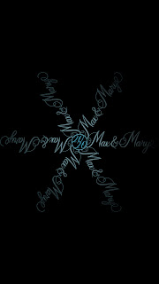
When working in digital media, you can save as a PNG file. This can give a transparent background, though if you share a file with someone, unless they open it in a program, it shows up with a black background if you don't specify what colour of background. I had been working with the white workspace and when I shared it with my friend, it appeared black. At first I was disappointed, but then thought it looked pretty cool. You can see what I mean about long text making the snowflake look a little spindly. I could have done 8 spokes, or added more glyphs/swashes to fill it in. I might even try doing basically two snowflakes--one for Max, one for Mary, and then stack them so they alternate around the snowflake. Only one center circle needed.


I also used transparency as part of the gradient to make it fade away at the ends of the spokes.

For Cheryl's, I wanted a white background again, to give the snow feeling. But with the light colours that makes it hard to see. I ended up with darker font colours than I intended. 

Gradients. I am not about to write a tutorial on that. I watched some videos; I recommend https://www.youtube.com/watch?v=RzrQUkJEdaQ starting at 21:00.  

Somehow, with playing with the gradients, I got a little bright spot near the middle. Like a twinkle!  All it is is a lighter version of the colour around it, as part of the gradient. 

I liked the snowflake as it was, but it was so fine and maybe hard to read. I remembered a bit about making the neon text from Logos by Nick, the link is near the start of this tutorial (in the part about cutting out bits of letters to make them look neon). What if I added an offset to thicken it? I duplicated it, page down, and did an outset a little bit bigger. Then, the final touch--I blurred the offset just a tiny bit, 1.5% and the opacity is at 77%. 

This is a screenshot, which doesn't do it justice. 

To change the background of a PNG file, go to File--->Document Properties; it's near the bottom. Pay attention to the bottom colour bar. That's for the opacity and if you want it to show the black, it has to be at 100. 


And there you have it! Hopefully you learned a few new skills. If you're on Instagram, you can tag me at tracykmvetzal I would love to see the projects you make from these tutorials!


Monday, January 18, 2021

Figure Skater 3D Layered Project

 I can't believe I haven't posted this! I made it early in the Christmas season because I knew I had to get it done before my surgery. Then I put it in the drawer to hide it and didn't get it assembled right away. 

It's a free design from the incredibly talented Gjoa at Special Heart Studio. She is so generous with her talent! If you haven't subscribed to her website to access her free designs, DO IT NOW. https://specialheartstudio.com/ 

Isn't she gorgeous? Megan's dress this year (and last) is red, but I didn't want to do the skater in red. So I chose a dark red for one of the inner layers. 

There's a total of 6 layers. It's not too time consuming to make but has high impact!

For the silver layer, I used the silver "vinyl film" from Dollarama and stuck it to white cardstock, then cut it out. Such an easy and cheap way to get fabulous options other than plain cardstock. 

I was worried the skater wouldn't stand out with the top ring being black as well. Not an issue though.

Two tips for this (and any layered projects). One--be mindful of how you set the layers down after taking them off the mat. Even make a sticky note, indicating if you've put them right side up. I had to do some turning and flipping to make sure I had the layers correct.

Second tip applies to any layered project. Parchment paper! I learned about using it for layering vinyl and thought "will it work for paper?" Yes, it does! I expose the adhesive on a small section of foam dots, put the parchment paper under the layer, and secure those few dots. Then I lift up the layer and peel the backing off a few more dots. Using the parchment paper means I don't have to worry if one gets stuck because I took the backing off. It's an extra piece of security. I also stand directly over the project to get the best view. And slow down! The first project I made, I went too fast. I wasn't rushing, but I just didn't realize how slow I should go. 

I'm hoping Gjoa will make a male version. I could probably alter the file....but it's her design and I don't want to muck about with it.